Between Word and Image: The Creative Mind of David Jones
David Jones (1895–1974) was an artist, poet, writer and craftsman; a name synonymous with the Modernist era but one that still remains lesser known...
Guest Profile 21 October 2024
Vilhelm Hammershøi (1864-1916) was a Danish painter known for poetic, subdued portraits and simple interiors, always muted in tone. His works are characterized by a limited color palette consisting of grays, as well as desaturated yellows, greens, and other dark shades. Their simplicity and melancholic vision give them an air of tension and mystery. If you have never heard of Hammershøi, welcome to his world.

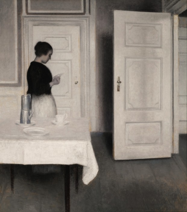
Created in 1899, Ida Reading a Letter was one of the first works painted by Hammershøi in the rooms of his home on Strandgade 30 in Copenhagen, Denmark; an address that was to play a critical role in the artist’s life. The idea was of Hammershøi’s wife. This sparsely furnished space, with its bare wooden floorboards, perpendicular wall moldings, sentinel stoves, and solid white-painted doors quickly became the central motif of his work.
Hammershøi’s use of light, muted tones, and choice of subject are indebted to the Dutch 17th-century master Johannes Vermeer. It seems impossible that Hammershøi did not have Vermeer’s work in mind while painting this composition.

Hammershøi created a series of paintings made from this viewpoint in the apartment but this painting seems to be the most poetic of them all. Hammershøi captured a sense of timelessness and introspective solitude. As Hanne Finsen and Inge Vibeke Raashou-Nielsen wrote, in his interior landscapes:
Light is the principal subject…and that light is the meagre Danish winter light, the light of grey weather quite without color, warmth, or gaiety, albeit so rich in nuance…There is a light that pours in over the canvas and defines the space…The light is usually indirect for, of course, Hammershøi also knows that indirect light is often the most beautiful…
Hanne Finsen and Inge Vibeke Raaschou-Nielsen, Vilhelm Hammershøi, En Retrospektiv udstilling, Copenhagen, 1981, p. 16.

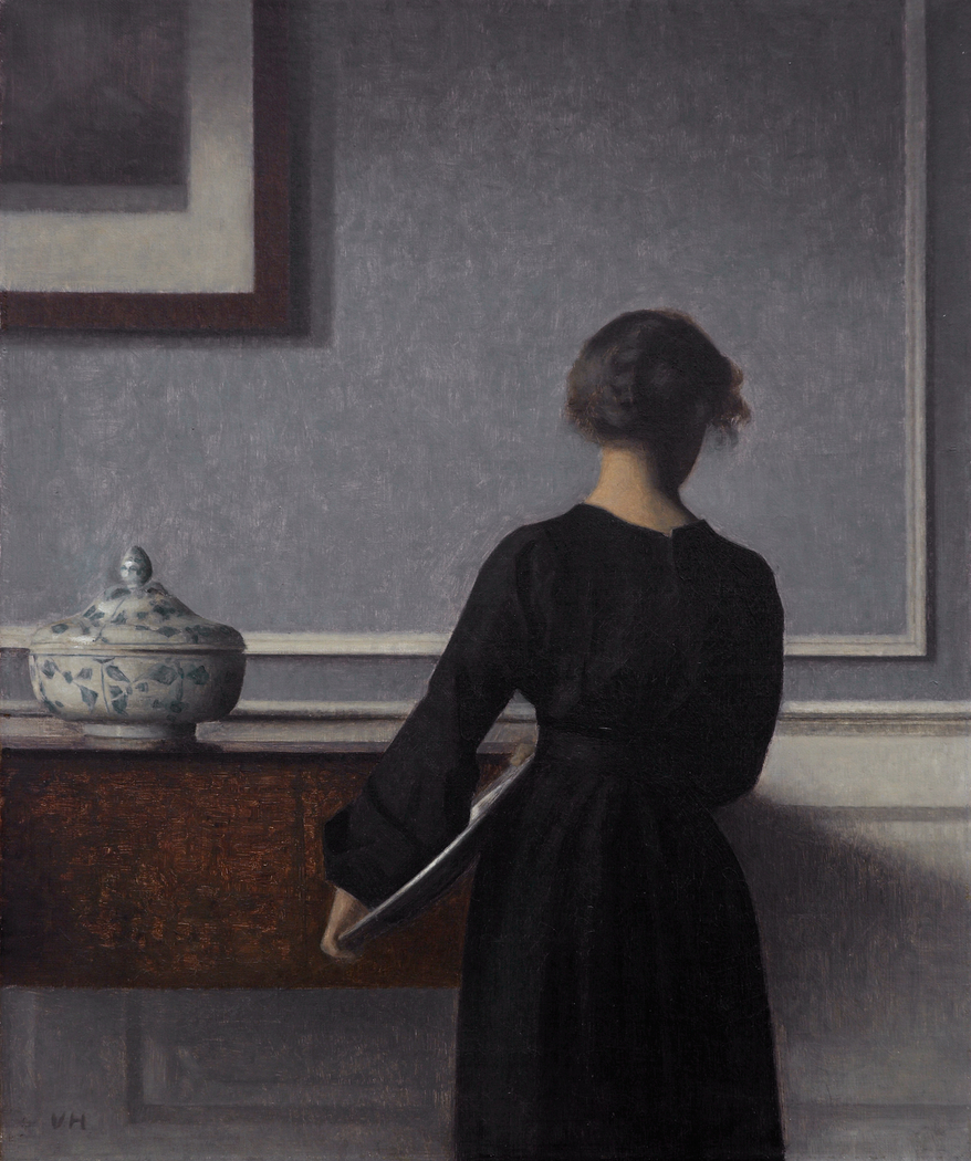
There is a hypothesis that Ida is often depicted facing away because, in the portraits in which she is facing the viewer, her face reveals “a troubled soul”. Perhaps Hammershøi painted her in the structured, minimalist interiors as a response to an emotionally fraught domestic life. We can’t be sure if that was Hammershøi’s motivation, but we do know that for the decade that he resided in the apartment on Strandgade 30 he painted more than 60 canvases depicting the rooms of the dwelling, often including Ida.

What makes me choose a motif is as much the lines in it, what I would call the architectural stance in the picture. And then the light, of course. It is naturally also very important, but the lines are almost what I am most taken by.
Vilhelm Hammershøi, quoted in “So true, so intimate“, The Guardian.
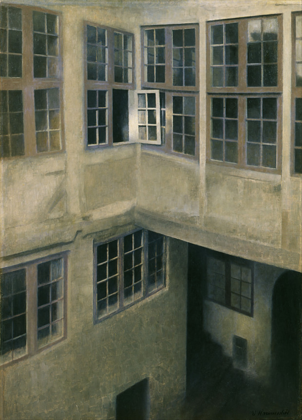
Here he renders the building’s interior courtyard with strong illumination focused on an open window. Three doorways at the lower right, each obscured, respectively lead to the street, to a staircase, and to the cellar. The eccentric and irregular geometries created by walls and windows, overhangs and thresholds, in conjunction with the essentially monochromatic gray palette punctuated by restrained mauve, endow the composition with a distinctly disturbing quality. The open window and doorways suggest human presence, but the overall effect is one of profound absence.
DailyArt Magazine needs your support. Every contribution, however big or small, is very valuable for our future. Thanks to it, we will be able to sustain and grow the Magazine. Thank you for your help!