Madness in Art: A Powerful Connection
Madness and art have long shared a profound and powerful connection, where the boundaries between genius and instability often blur. Many acclaimed...
Maya M. Tola 28 October 2024
Art creates emotions and, generally, you either like a certain piece of art or you don’t. But despite that, what is valid for everything else is also valid for art. If you invest some time in art, get intellectually and emotionally engaged, you will start to look at it with different eyes. And a whole new world of insights will open to you. Here, you will find three reasons why it is worth learning about art.
As art is all around us and has been so for as long as we remember, it is part of a general knowledge to get acquainted with art. Today, you can easily find information about certain artworks, especially if you find yourself in a museum or an art gallery, or you simply see a sculpture on the street. These are situations where you know that this piece should be something important or famous and you can easily search for information about it on the internet. But there are circumstances when you don’t really know that you are actually looking at an artwork or at an allusion to some work of art and therefore you are losing one whole aspect of some story, situation, or other work of art.
For example, famous paintings often serve as a visual reference to filmmakers, inspiring them with their treatment of light and composition. In this way, films pay homage to famous artists. Of course, if you don’t know the artwork, you will not be able to recognize a certain shot that is referencing a famous painting.
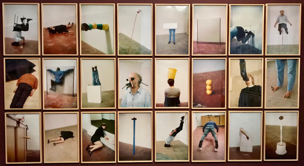
One interesting example is how the work of an Austrian artist Erwin Wurm (born 1954) was recreated in the clip Can’t Stop from Californian rock band Red Hot Chili Peppers. Wurm started to make his series One Minute Sculptures in 1988. It comprises video, performance works, and photographs. The performative process began with Wurm delivering instructions to the anonymous participant, performer, or curator. The participant afterward performed the determined figure or action with everyday objects such as clothing, buckets, balls, doorframes, or bicycles and maintained it for a period of 60 seconds. During this time, the pose was photographed. Actually a short time, one might think, but in an awkward or uncomfortable situation, one minute could be pretty long. The observer becomes part of the artwork, and his limits are often tested. The resulting compositions are both humorous and provocative.
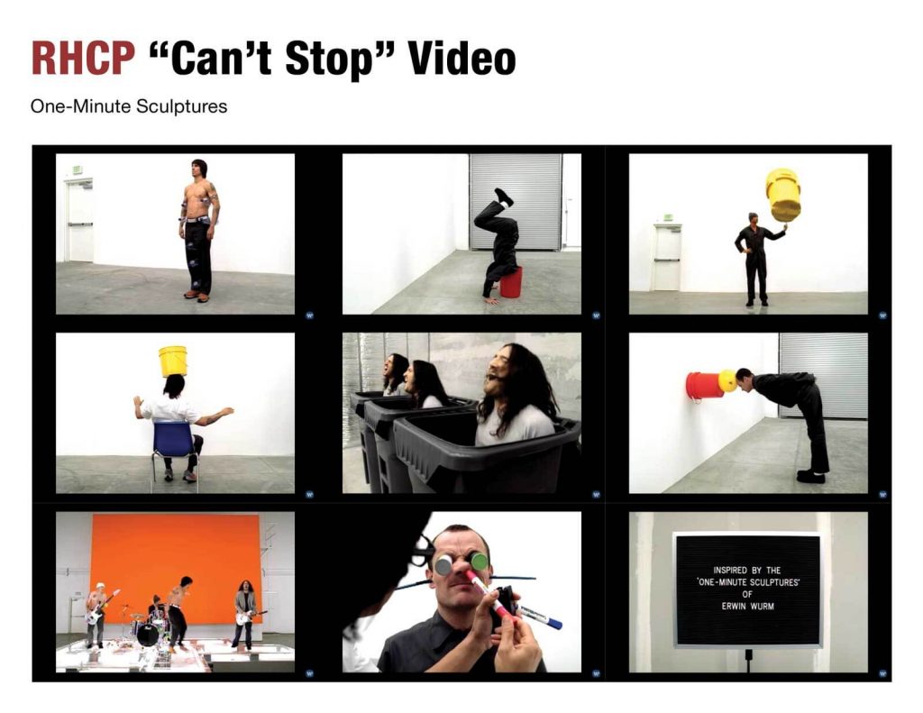
In a clip of RHCP, band members engage in various activities like holding many water bottles or attempting to balance buckets on their heads. The drummer is hiding under a cardboard box. The bassist is having markers shoved up his nose and film canisters popped into his eyes. They use everyday objects in absurd situations. Images are created to amuse you and to encourage you to look at the world from a different perspective.
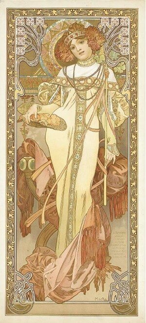
Sometimes, artworks show up in some movie scenes and if you don’t know them, you will never catch sight of them in often short scenes. For example, in Quentin Tarantino’s latest movie Once Upon a Time in Hollywood (2019), there is a scene with Margot Robbie bobbing her head as she starts to feel the groove, and the poster L’automne by Alfonse Mucha (1860-1939) can be noticed in the background. It depicts a beautiful young woman, sensually provocative and appealing.

This lithographed advertising poster was created for a play featuring the celebrated actress Sarah Bernhardt in 1894. It is colored in pale, watery tones with decorative, elegant linear forms in Art Nouveau style.
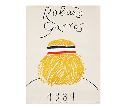
In Luca Guadinigno’s film Call Me by Your Name (2017), only practiced eyes will spot Eduardo Arroyo’s (1937-2018) promotional poster for the French Open at Roland Garros from 1981 among other posters hanging on the walls of Ellio’s room.

Arroyo was a socially engaged artist and critic from Spain and was a key figure in the figurative art movement. In 1958, he fled to Paris to escape Franco’s regime and returned in 1976 after the death of Franco. The poster illustrates the back of a tennis player’s head, inspired by Björn Borg with his famous headband and blonde hair.
By looking at modern art, especially abstract and readymade art, you can often hear a comment like, “That’s not art! Even I could have done this!”, implying that it requires no skill to make such a piece of art. Maybe you have found yourself thinking similarly. No wonder, such criticisms can be heard even from highly educated people.
For this reason, it is very interesting to look at the process of how Piet Mondrian (1872-1912) reached his geometrical composition built from the simplest elements – exclusively of horizontal and vertical lines encasing blocks of contrasting bright colors in perfect composition balance.
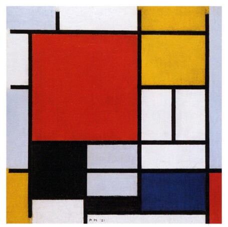
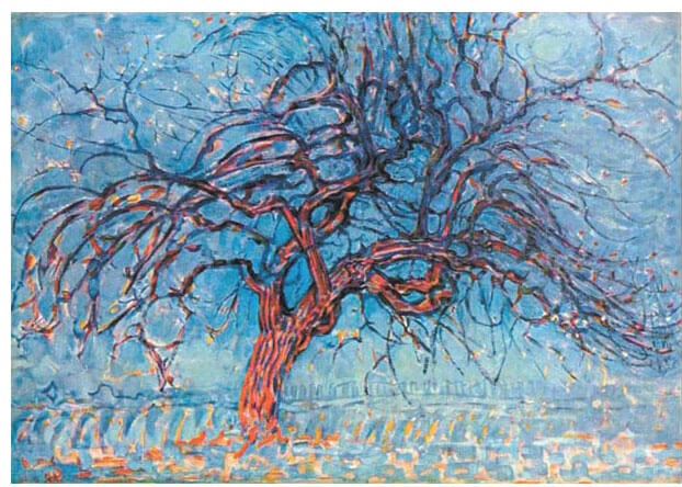
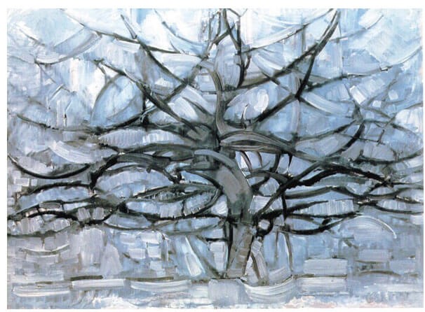
Now, to start, just think about how he painted all the lines by hand! He never had to use a ruler. You can compare Julije Knifer’s meanders that were also always created freely, only by the artist’s hand. And of course, Mondrian didn’t start out painting squares and rectangles. Let us follow his aesthetic evolution, from objective, figurative representation of a tree to pure abstraction. He has been painting his series of tree paintings over a period of five years between 1908 and 1913. He has painted the same tree over and over again, altering the visual style with each painting.
The Red Tree is a Post-Impressionistic piece with a representational form of a tree in which he implemented his color palette of red, blue, and yellow, the three primary colors.
With his analytical skills, he further limited the colors he used, eventually to grey monochrome. In The Gray Tree, trunk and branches are still obvious.
In Flowering Appletree, he painted a tree shape out of the major branches, a sort of a tree diagram.
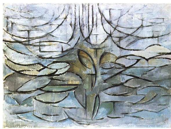
Flowering Trees is again more abstract, actually an imaginary tree.
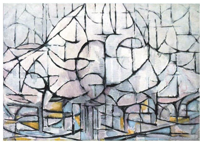
Furthermore, in Composition II, he has eliminated diagonal and curved lines and limited the painted angles either to vertical or horizontal.
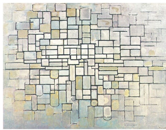
The last two paintings are actually recognizable as trees only when seen in their developmental sequence. So, Abstract art allows artists to express themselves on another level. Many of them created abstract works as a part of their natural evolution and experimentation with several different styles and techniques. Knowing that helps understand modern art.
The more you look at modern and contemporary art, the more time you spend with it, and the more you know about it, you come to appreciate the work of more and more artists, who express varying levels of abstraction in their work. Slowly but surely, you become attracted to paintings and sculptures that seem to bear no relation to the physical world, until you reach the moment when a piece of abstract art like Malevich’s Suprematist composition White on White stirs your emotions.
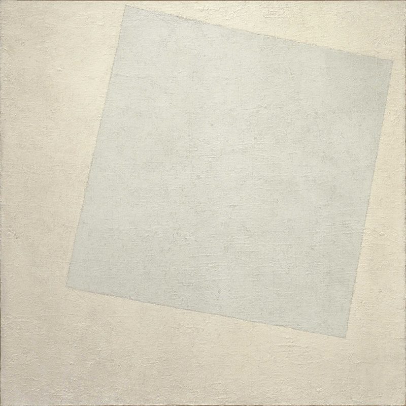
Kazimir Malevich was the founder of Suprematism, a system that strove to achieve absolute purity of form and color. In 1918, his non-objective art reached its logical conclusion in a series of works entitled White on White, consisting of a white square on a white background, the abstract to end all abstracts.
Art is not an ornament, which should be just liked or not, because it is created from something very personal. It is a result of reflection, of many attempts, and failures, and sometimes of very painful experiences. Therefore it is worth looking at, exploring the context, and thinking about.
P.S. Did you know that DailyArt is offering art history courses? Here, you can enroll for free and learn how to look at art, and enjoy it even more!
DailyArt Magazine needs your support. Every contribution, however big or small, is very valuable for our future. Thanks to it, we will be able to sustain and grow the Magazine. Thank you for your help!