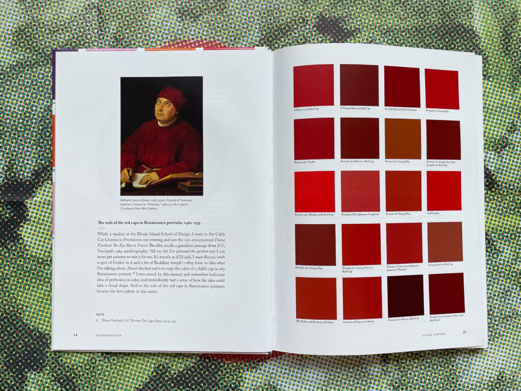
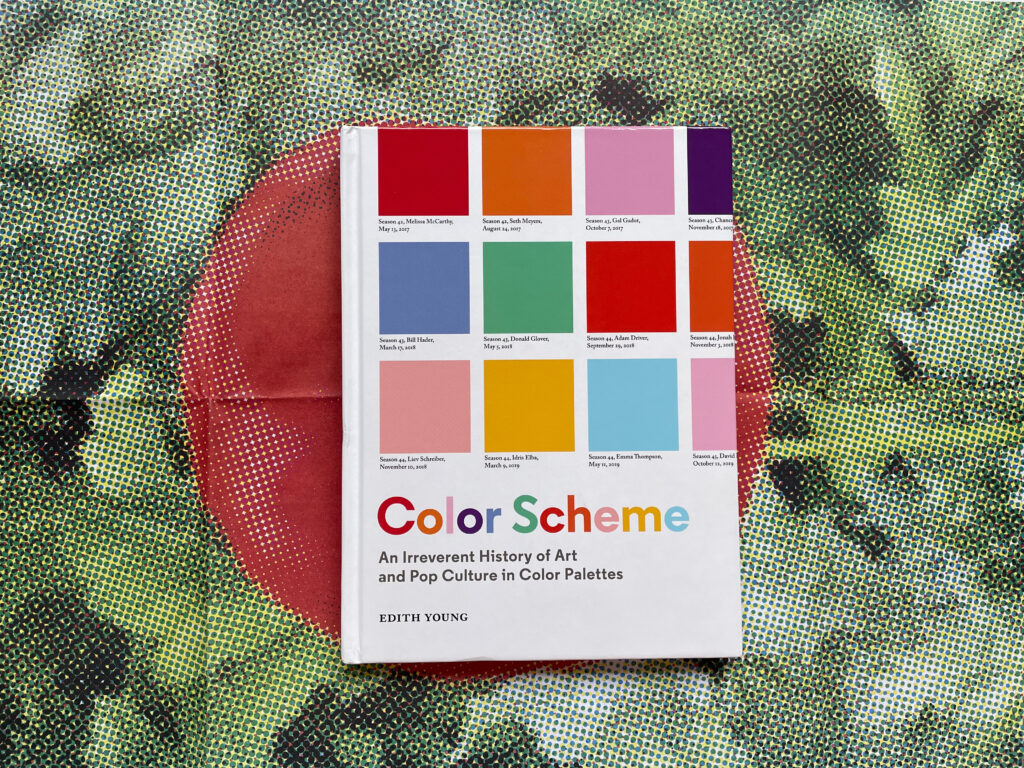
When Edith Young was a student at the Rhode Island School of Design she came upon a quote from Diana Vreeland:
The best red is to copy the color of a child’s cap in any Renaissance portrait
Young scoured her art history textbooks with Vreeland’s words in mind. The result was a color palette entitled The reds of the red caps in Renaissance portraits, 1560-1535. Pulling from 20 different paintings by the likes of Piero della Francesca, Bonifacio Bembo, and Lorenzo di Credi, Young creates a study of the color red that illustrates the overall similarities while also revealing surprising differences between the shades. In doing so, she both concurs with Vreeland and challenges her definiteness.
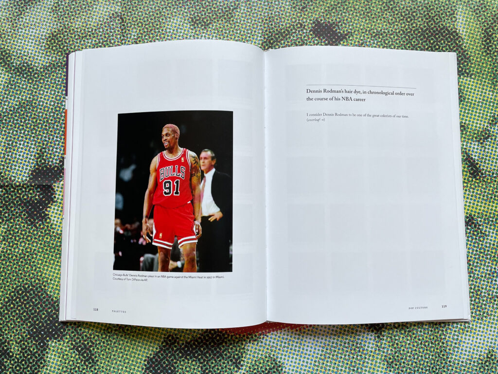
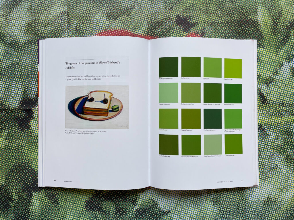
Thus begins the energetic Color Scheme: An Irreverent History of Art and Pop Culture in Color Palettes, which contains over 30 palettes drawn from a vast variety of sources, including the dresses of Velazquez’s infantas to the ever-changing color of Dennis Rodman’s hair during his NBA career.
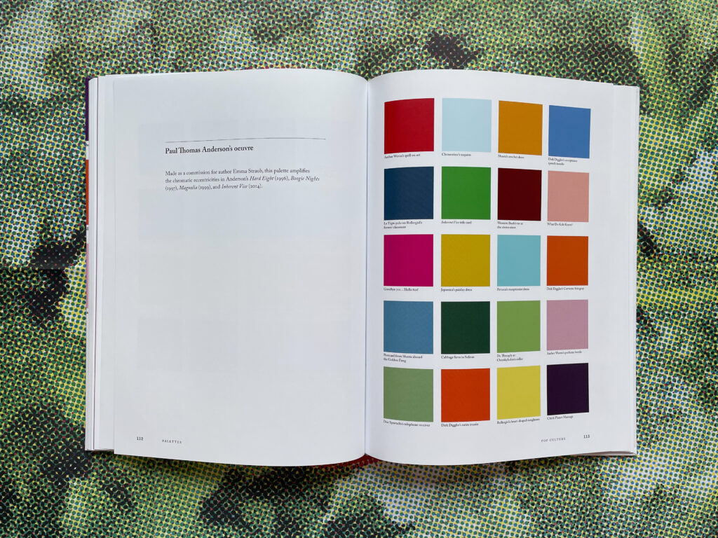
The palettes are divided into three sections: art history, contemporary art, and pop culture. Connecting the sections are essays in which Young further investigates the role of color in art, culture, and design. Highly personalized and wide-reaching, Young is interested in linking the past to the present, the highbrow to the lowbrow.
She writes:
I always feel tasked with finding the clues within works that share a visual language
Diego Velazquez is linked to Picasso, then to Manet, then to Francis Bacon, and finally to Kerry James Marshall. Though this telling of the history of art and artists lacks some nuance, it is ultimately a satisfying look at how painters build on the work of their predecessors and the accumulative vocabulary of art history.
Young worries that the form of the color palette has been belittled by Instagram, where anyone can create a grid of images arranged solely for aesthetic or capitalistic purposes. She isn’t completely without hope, however, acknowledging that social media palettes have the wider public “recognizing the work of colorists.”
One of Young’s essays is dedicated to the idea of a typology, or a means of classifying visual data. Organizing imagery seems to be a chief preoccupation of Young, who throughout the book references the practice as a sort of game she plays within her own life. In the typology essay, Young discusses several contemporary artists who use typological methods in their work like Lisa Young, Penelope Umbrico, and Joseph Grigley.
Moving from art to pop culture, the last essay in Color Scheme is dedicated to color in relation to design (and therefore, commerce). Taking brands famous for their colorful products like Le Creuset, Marimekko, and Fjällräven as an example, Young discusses the business cunning behind the limited-edition colored product. Linking this strategy to those employed by Pop artists, she finishes the book at the intersection of fine art, pop culture, and capitalism.
Color Scheme is a treasure hunt with a singular point of view. Young’s curiosity knows no bounds, she is as interested in the paintings of Caravaggio, Alice Neel, and Lucian Freud as she is in the mountaintops of the diorama paintings in the American Museum of Natural History or the sartorial choices of Pete Davidson. In doing so, we get a fresh perspective on not just the colors of art history, but also those of everyday life. What’s more, we see how deeply interwoven the two really are.
My favorite life-meets-art moment of Color Scheme is the caption for the palette entitled Helen Frankenthaler’s orange color fields:
I woke up at 4:30 a.m. with a mosquito buzzing incessantly in my ear and around my head. It was mid-July and one of the longest days of the year. I looked out my window and caught a glimpse of the sunrise, which was a remarkable, potent field of deep orange—just like a Helen Frankenthaler painting

