Snuffboxes: Ornate Relics of a Bygone Era
Decorative snuff boxes were highly ornate containers for powdered tobacco, the consumption of which was a fad that swept the 17th century. By the age...
Maya M. Tola 27 February 2025
Introducing the pioneers of contemporary interior design: these five remarkable women have revolutionized our perception of living, working, and hospitality spaces. With innovation, creativity, and a keen eye for detail, they have changed the approach to interior design forever. Join us as we celebrate their extraordinary contributions and explore how their creativity shaped the places we call home, the offices where we work, and the hotels we stay in.
The word “contemporary” can be defined in many subtly different ways. Here allow me to stick to the following definition: “the second half of the 20th century or in the 21st century.” We’ll be looking at a quite wide timeframe here. Not only strictly current designers, but rather those who shaped how we think of interior design today. When you think that we spend 95% of our time in some sort of interior that influences our mood and emotions, the importance of interior design becomes clear.
Have you ever stayed in a hotel where the color palette was extremely annoying? Or been to a restaurant where the lighting made all the guests look like zombies and the food completely unappealing? Or have you ever entered a room that instantly made you feel at ease? All of these are failures or successes of interior design. They can make or break any space and experience.
Sister Parish (1910-1994) was known as the “First Lady of American Decorating”. She was born Dorothy May Kinnicutt and her mother was from the Tuckerman family. This meant that Parish was a cousin to none other than Dorothy Draper. Originally the nickname “Sister” was coined by her younger brother. She later adopted it, although it led to many funny misunderstandings where she was taken for a nun. Raised in a wealthy family, she married Henry Parish II. Soon after their wedding, she started decorating their farmhouse on Long Lane in Far Hills, NJ. Never formally trained, this was where she honed her own style.
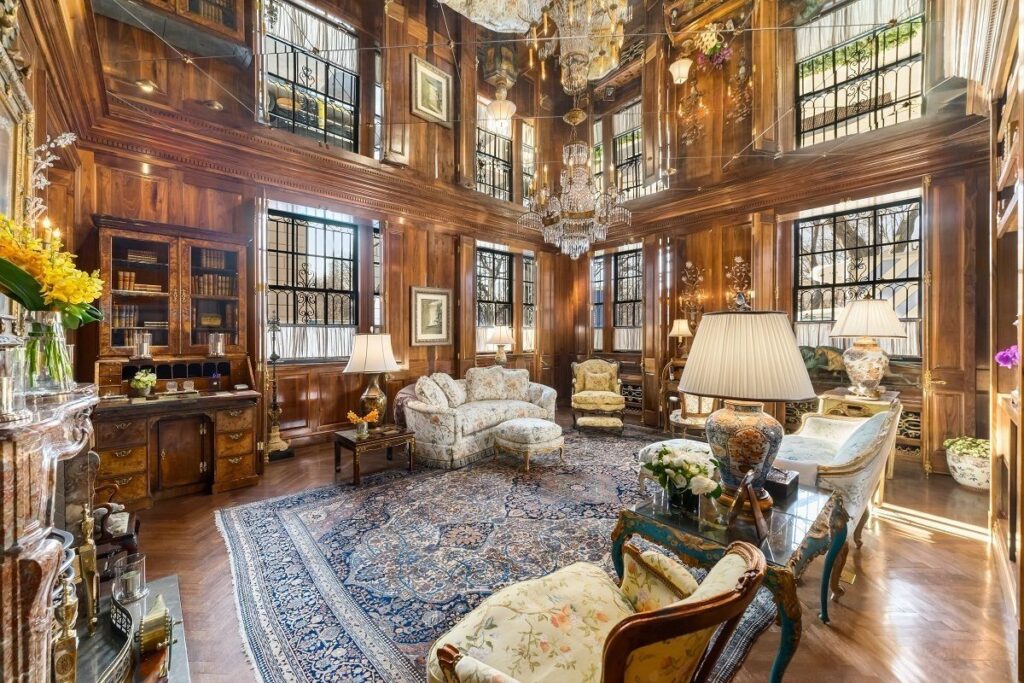
There is a chance Sister Parish would have led a comfortable life, never bothering with professional interior design if it weren’t for the Great Depression. The recession hit both her husband and her father hard, forcing Sister to take matters into her own hands. In 1933 she opened her own decorating business in a tiny office with a sign advertising “Mrs. Henry Parish II, Interiors”. Gradually she built up a client base and soon it was full of well-known names: Astor, Vanderbilt, Whitney, Paley, Mellon, Getty, Engelhard, Annenberg, Bronfman, and Rockefeller.
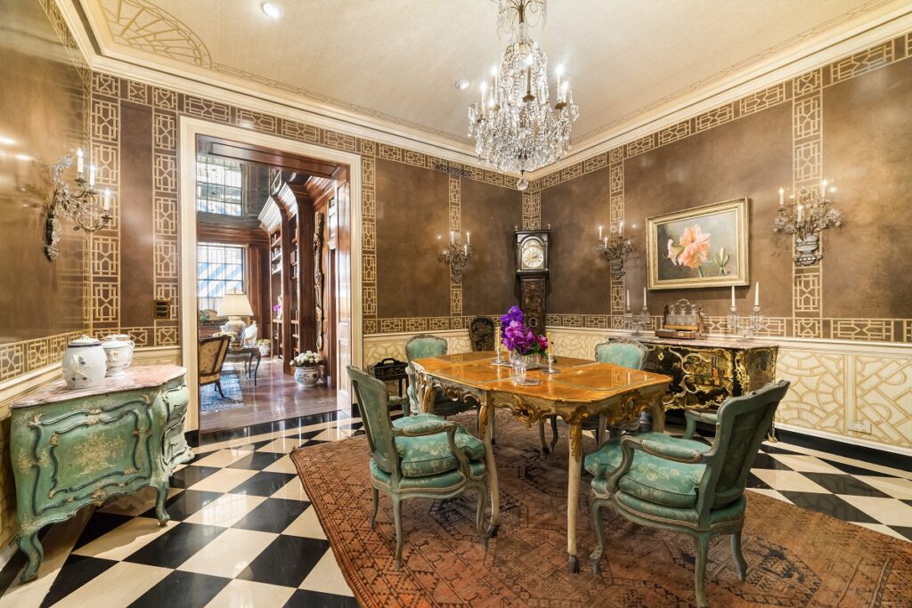
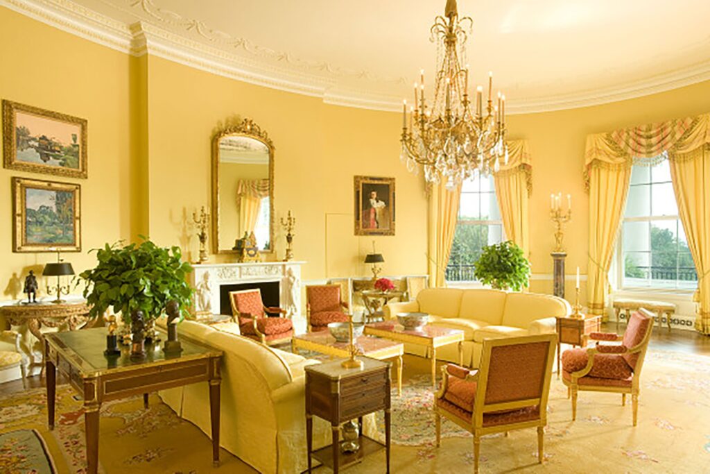
In the 1950s, Parish met Jacqueline Kennedy. She helped to decorate the Kennedy’s family house in Georgetown, where they lived while John F. Kennedy was a senator. When he became the US president, Jackie Kennedy commissioned Sister Parish to decorate their private quarters. One thing to know about Sister Parish – she was not cheap. She would not accept cheap materials, so her decorations cost a fortune. This was probably the cause of the rift between the designer and the First Lady. (Gossip would have it that Parish kicked or shouted at Caroline Kennedy, depending on the version, and that this caused the rift). Parish was swiftly replaced by Stephane Boudin who was then commissioned to decorate the State Rooms. He also redesigned some of Parish’s work after she left. Nonetheless, we know that the Yellow Oval Room was definitely designed by Sister Parish.
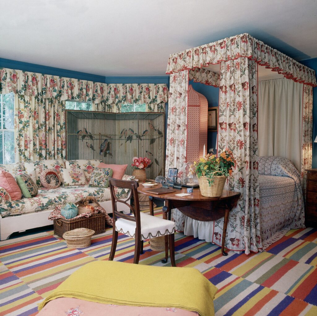
Parish is widely considered to have originated what became known as the American country style. The term means rooms that are at the same time full and comfortable, stylish, but inviting and habitable. They feel unstudied and never come across as stiff or overdesigned. She’d happily mix famous brands with charming distractions and put things off-center. The idea was to make the rooms liveable, rather than allow them to become an exhibition space for famous brands and stylish furniture. The rooms are often full of light and light-colored furniture, but she also did not shy away from a single bold-colored accent, just to shake things up. Sister Parish interiors often included painted floors, painted furniture, chintz, needlepoint pillows, starched organdy, botanical prints, painted lampshades, white wicker, quilts, and baskets.
As she said herself:
Innovation is often the ability to reach into the past and bring back what is good, what is beautiful, what is useful, what is lasting.
-Sister Parish
Andrée Putman (1925-2013) was a French interior and product designer. Initially trained as a musician and composer, after a serious bike accident at the age of 20 she decided to pursue a different path. The problem was that she was not trained in anything else. Hence, she became a messenger for Femina magazine. She then moved through a series of other press jobs, but her heart was in helping misunderstood and underappreciated artists. In 1971, Didier Grumbach spotted her talent for finding talent and hired her to start a new company, Créateurs & Industriels. The company aimed to develop the textile industry. Her intuition led Putman to reveal many talented designers such as Jean-Charles de Castelbajac, Issey Miyake, Ossie Clark, Claude Montana, and Thierry Mugler.
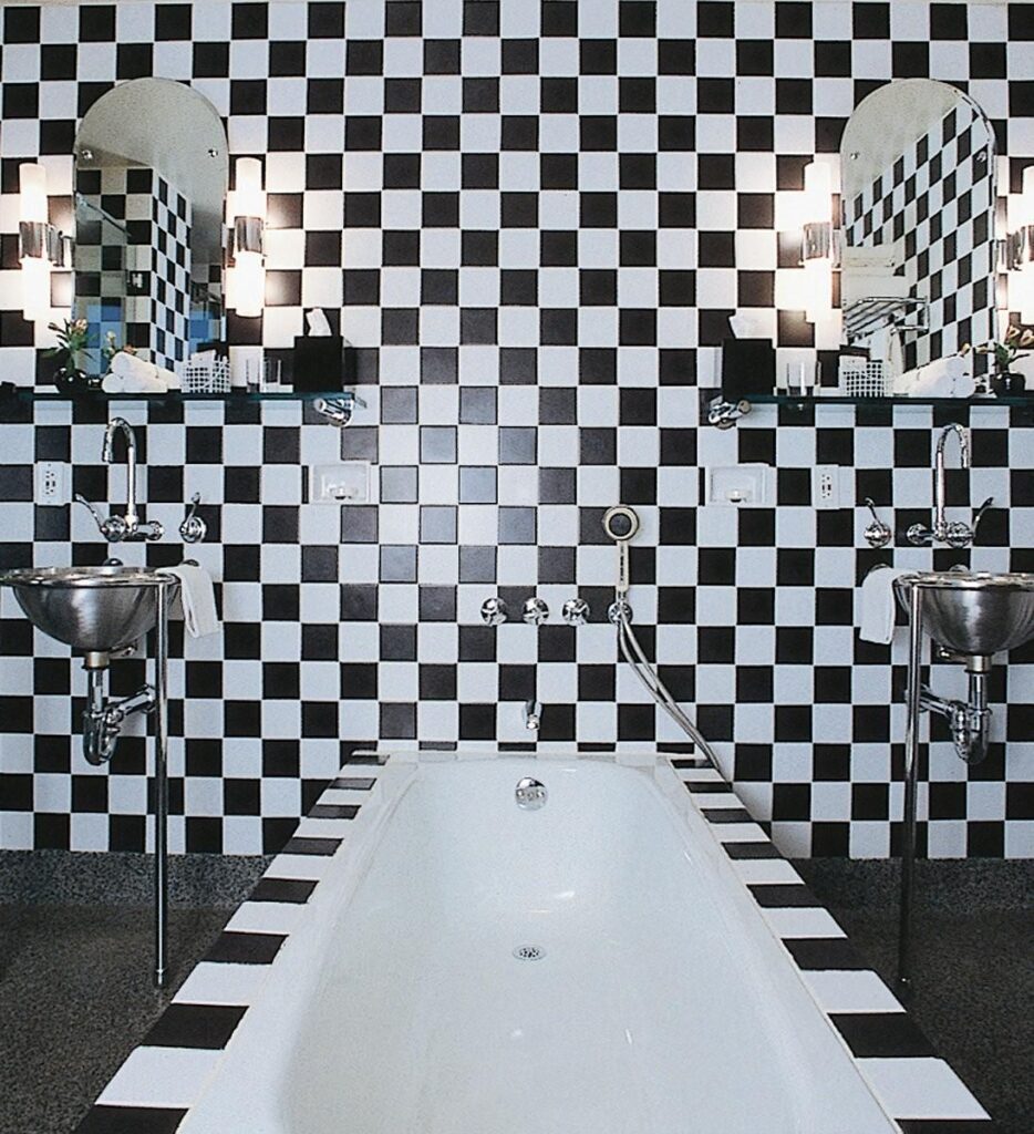
She decided to explore the field of interior design when she converted the old offices of SNCF into her own showroom. By the end of the 1970s, Créateurs & Industriels went bankrupt and Putman got divorced, both of which hit her hard. At that time she lived in an austere room with just a bed and two lamps, trying to find a way out of the emptiness she felt. A friend talked her into opening Ecart, and this is where, at the age of 53, her career as an interior designer really took off. She began by rediscovering forgotten furniture designers from the 1930s and then quickly moved into designing whole interiors.
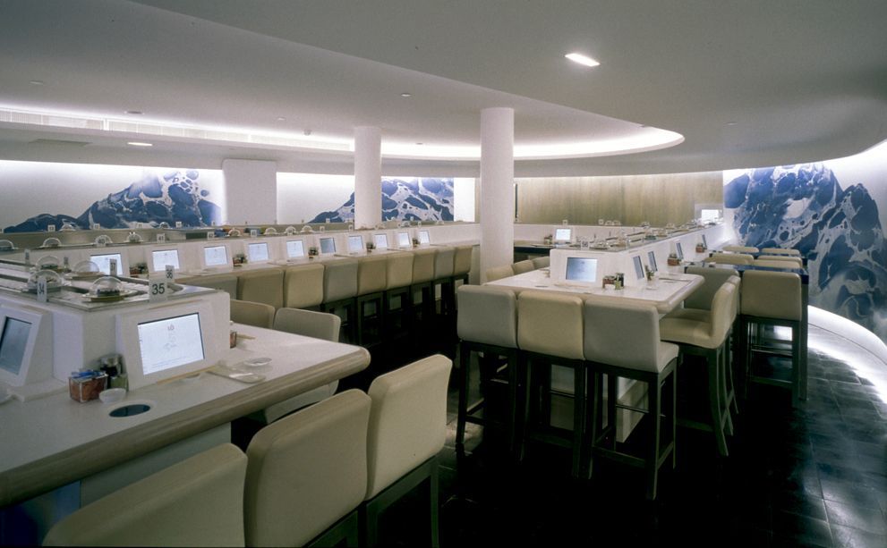
Her breakthrough came in 1984 with the Morgans Hotel in New York, where she managed to redesign a high-end hotel on a small budget while firmly expressing her style. In the 1980s she worked for many more hotels as well as stores; brands like Azzedine Alaia, Balenciaga, Bally and Lagerfeld, and even an office of the French Minister of Culture, Jack Lang. In 1994 she also designed the interiors for Air France’s Concorde plane, which no longer operates.

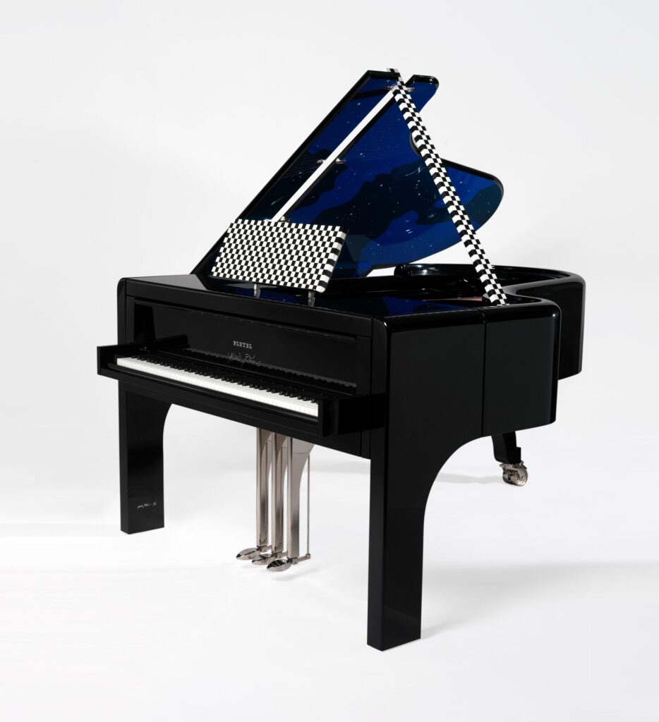
In 1997 she created the Andrée Putman Studio and from then on there was no stopping her. The studio designed anything and everything, not just end-to-end interior design. She designed furniture, cutlery, and redesigned flagship stores for fashion brands. Nothing was too small, such as a tea set for Given: Polka, or too big, like the Voie Lactée piano for the brand Pleyel. She also continued to work on private commissions.
Her own words summarize her style best:
I loathe pompous luxury. I take interest in the essential, the framework, the basic elements of things.
-Andrée Putman
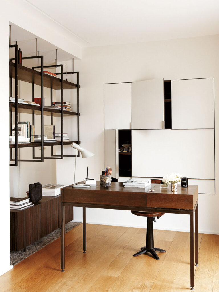
Florence Knoll (1917-2019) was an American interior and furniture designer whose work revolutionized office design. She brought modernist design into the office space, for good or bad. After Knoll, we were done with heavy mahogany and oak desks. As a young woman she attended Kingswood School for Girls, which was right next to the Cranbrook Academy of Art. This is where she befriended Eliel Saarinen, who she later studied under in Cranbrook. She spent a vacation with the Saarinens in Finland and knew their son Eero well. With recommendations from Eliel Saarinen and Alvar Aalto, Knoll went on to study under some of the greatest 20th-century architects. These included Walter Gropius and Marcel Breuer in Cambridge, Massachusetts, and Ludwig Mies van der Rohe at the Illinois Institute of Technology.
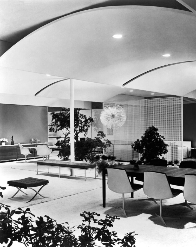
In 1941, Knoll moved to New York where she met Hans Knoll who was establishing his furniture company. For a few years, she worked with him informally, designing furniture as well as the company’s showroom. In 1943, she joined the company full-time and founded its interior design service, the Knoll Planning Unit. This was a revolutionary step. She maintained that she did not merely decorate space; she created it. The Planning Unit rigorously researched and surveyed each client. They assessed their needs, defined patterns of use, and understood company hierarchies before presenting a comprehensive design.
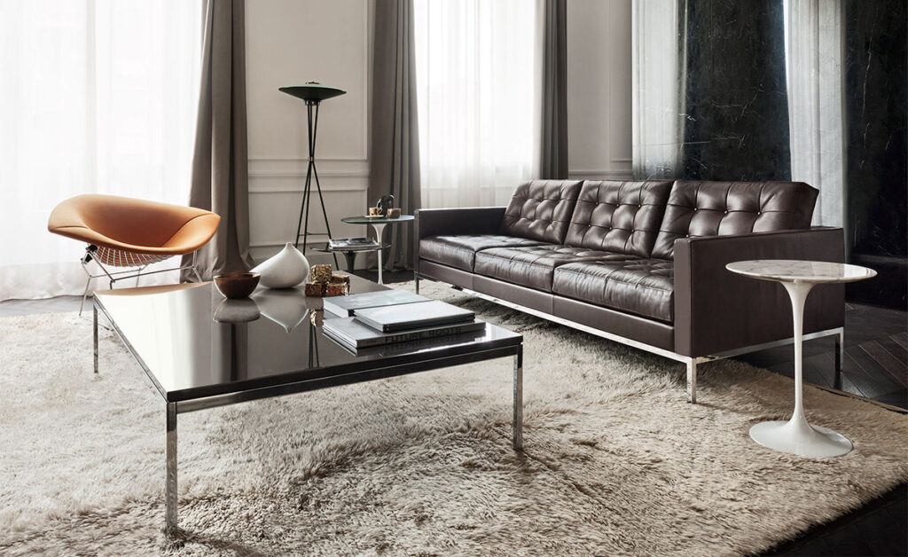
At the same time, Knoll continued to design furniture for the company’s catalog. This already included pieces by designers such as Harry Bertoia, Mies van der Rohe, and Eero Saarinen. She humbly described her designs as “meat and potatoes”, a filler among their standout pieces. Yet, she also was a visionary because the Planning Unit completely changed the rules of the game in office design. She had the foresight and talent to bring it to life. The Unit completed over 70 office interiors, including the offices of major American companies such as IBM, GM, Look magazine, Seagram, Heinz, Connecticut General Life Insurance Company, and CBS.
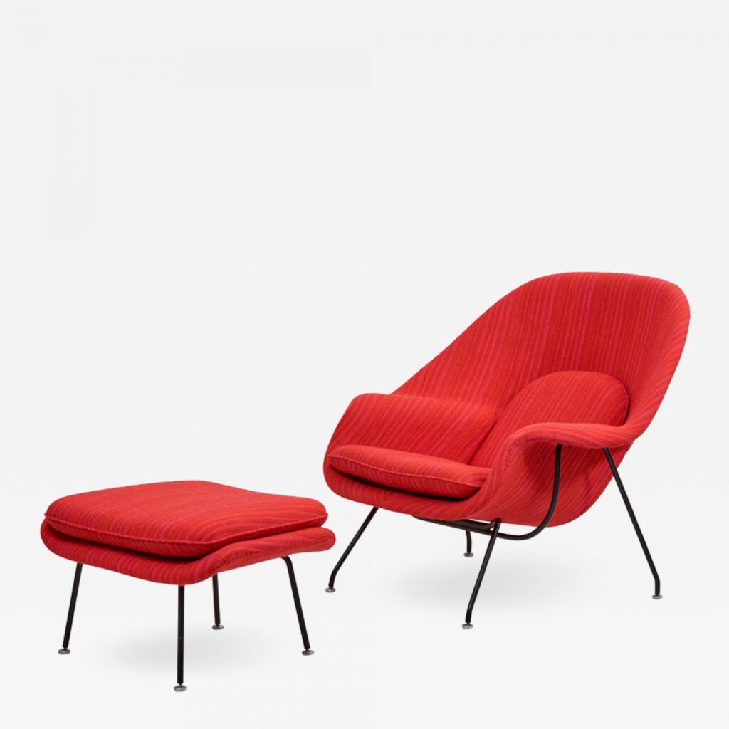
What is more, she was able to creatively leverage her contacts with other designers for the company’s sake. Being a designer herself, she combined an understanding of the situation with an entrepreneurial spirit. For example, Knoll asked Saarinen to design a chair that was “like a great big basket of pillows that I can curl up in”, resulting in his classic Womb chair. Then they worked with a fiberglass boat builder in order to manufacture it.
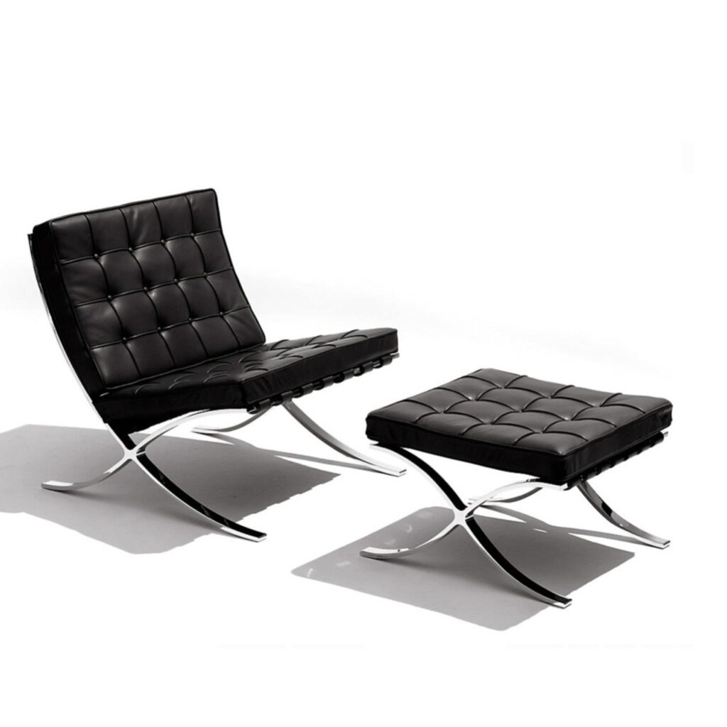
Knoll also persuaded her former teacher, Mies van der Rohe, to give Knoll the rights to the Barcelona Chair which he had designed with Lilly Reich in 1929. She had the sculptor, Harry Bertoia spend two years in his studio to see if he could translate his metalwork into furniture and the result was his well-known wire chairs. She managed to attract a considerable stable of designer talent by paying commissions and royalties and ensuring credit for designs.
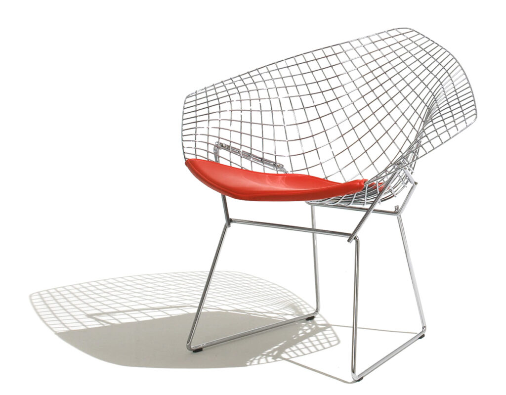
Knoll and her Knoll Planning Unit revolutionized office design, replacing antique styles and haphazard arrangements with the signature “Knoll Look”. This was marked by rationalized space plans, modern furniture, sleek geometries, and integration of structure, color, and texture. In the 1940s, office decoration had been dominated by antique and period styles. Typically offices had traditional, heavy, carved, mahogany desks placed diagonally in the corner of a room, another diagonal table behind it, scattered chairs, and a glassed-in bookcase. Knoll replaced the old executive desk with light, sleek modern designs, as well as straightened the diagonal positioning. Workspaces became more open with seating areas for informal discussions. She also redesigned conference tables into a boat shape so that people could see one another to accommodate group discussions.
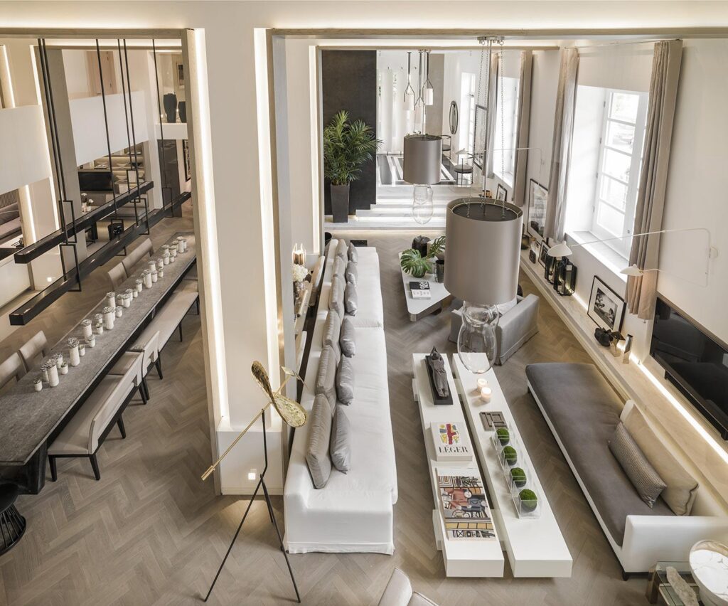
Kelly Hoppen (b. 1959) is a South African-born, British interior designer, author, and proprietor of Kelly Hoppen Interiors. Hoppen is sometimes called “The Queen of Taupe”. She began her adventure with design at the age of sixteen when she had an opportunity to design a family friend’s kitchen. During a career spanning 40 years, she designed the homes of private clients as well as commercial projects in several countries, including hotels, restaurants, offices, and aircraft. Her celebrity clients include David and Victoria Beckham, Martin Shaw, Gwyneth Paltrow, and Guy Edwards.
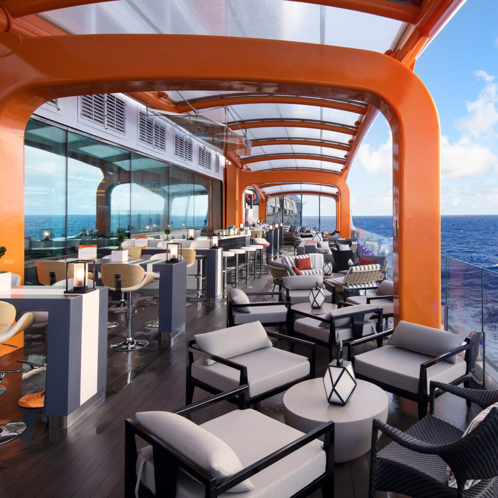
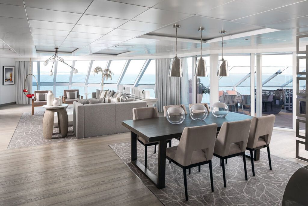
In her work, Hoppen does not focus solely on residential spaces, she also designs yachts, hotels, and jets for private clients all over the world. Her work even includes the most impressive cruise ship to date, Celebrity Edge; redefining sea travel.
Her style is a subtle fusion of East meets West; clean lines and neutral tones, intuitively balanced with an opulent warmth. It usually involves a tranquil and ordered space, modern in feel, and with a neutral color palette. She uses taupe a lot, hence the nickname, but is not averse to evolutionary changes. You definitely won’t find any big splashes of strong color in her interiors though. It is all about calm and balance.
Kelly Wearstler (b. 1967) is an American interior designer and author. An interest in interior design came to her naturally given that her father was an engineer and her mother an antique dealer. From an early age, she accompanied her mother to thrift shops, flea markets, and auctions. After studying architecture and graphic design, she moved to Los Angeles where she had a fleeting affair with show business.
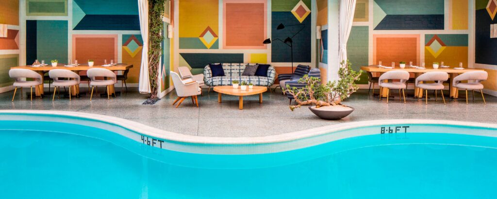
In 1995 Wearstler opened Kelly Wearstler Interior Design (Kwid, or KWID). The following year she met the real estate developer Brad Korzen, who hired her to design his house in the Hollywood Hills as well as several residential properties owned by his company. The first of the residences was the Avalon hotel in Beverly Hills and this was the one that made her name. She introduced humor into modernist interiors, which helped bring them to life and felt very refreshing.
This commission led to another one for Maison 140 hotel, also in Beverly Hills. A comparison of those two projects shows Wearstler’s versatility, but also the consistent style underpinning her work. Combining the past with playful joy and a wink to the future, she adapts her style to each commission, leaving her mark meanwhile avoiding boring repetition. Her interiors may feel heavy for the modernists among us, but neither do they take themselves too seriously.
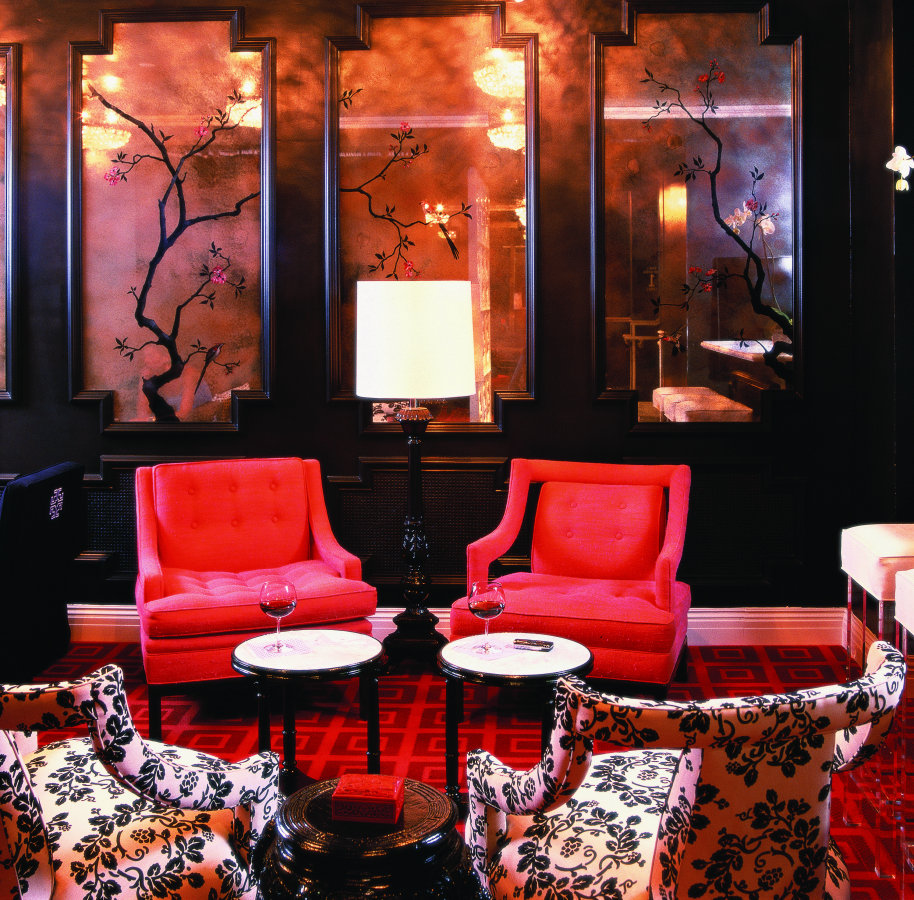
One of her larger commissions was designing Viceroy Hotels and Resorts, to which she gave an “almost theatrical” Hollywood aesthetic. From that point on, Wearstler expanded her scope by launching numerous lines of furniture and home goods. Next, she moved to open her own boutiques, as well as started work on a redesign of large shopping centers. She has also designed properties for clients such as Gwen Stefani, Cameron Diaz, and Stacey Snider.
DailyArt Magazine needs your support. Every contribution, however big or small, is very valuable for our future. Thanks to it, we will be able to sustain and grow the Magazine. Thank you for your help!