Lotus Temple and the Bahá’í Faith
The Lotus Temple is renowned for its distinctive lotus shape. A prominent Bahá’í House of Worship in New Delhi, the temple embodies...
Maya M. Tola 27 January 2025
13 January 2025 min Read
In the world of architecture, there are those who follow established styles and norms, and then there are those who break the mold and blaze their own path. Helmut Jahn was one of the latter. Known for his bold and daring designs, Jahn left an indelible mark on the urban landscape with his iconic structures that blended functionality, aesthetics, and sustainability in innovative ways. We are exploring the life and work of this visionary architect, who once declared that “every building must be beautiful, even if it costs more.” From his beginnings in Germany to his rise as one of the most influential architects of the 20th century, we’ll dive into Jahn’s style, his iconic buildings, and his impact on the world of architecture.
Helmut Jahn was born and raised in Germany, near Nuremberg, and during his youth, he had a chance to witness the rebuilding of this city after the disaster of war. He studied for his undergraduate degree in architecture in Munich and moved to Chicago in 1966. What drew him there was the chance to study under the wing of one of the titans, Ludwig Mies van der Rohe, at the Illinois Institute of Technology (IIT).
There are two ways in which change occurs in arts, either by developing an idea or style or by forcefully rejecting it and replacing it with a new one. Jahn clearly did not want to follow the first path, as he never graduated from IIT, leaving after refusing to follow his tutor’s briefs, just a year later. He joined forces with Charles F Murphy, and after Murphy retired, he took over the control of the firm.
Jahn knew what he wanted and it wasn’t the clean sparse lines of the International Style. He wanted power, bold forms, and big buildings that do not pretend to be light. Maybe a bit surprisingly, he actively tried to create more human spaces within his giant government and corporate creations. He did not strive for simplicity of form, but rather for simplicity of the message. His buildings tell very much about the power and success of their founders.
Architecture is all about going with your gut. I prefer when form follows force rather than function.
Helmut Jahn in an interview with Vladimir Belogolovsky, 2018, Architonic.
He was also keenly interested in technology and construction. This resulted in two things. First, his buildings often assume high-tech stylizations, which earned him the nickname “Flash Gordon of architecture.” Second is his close cooperation with engineers when designing his buildings. Jahn certainly was not one of those visionaries who designs an impossible building and then throws the design over the fence to an engineer to figure it all out. He preferred a more hands-on approach, wanting to cooperate with engineers in finding innovative solutions to his ideas. This also included the energy efficiency of buildings, and focusing on that in the 1970s and 1980s was infrequent, to say the least.
Jahn also remained very stylish in his personal life. He was always dressed to a T, driving a Porshe, owning several yachts, and using solely a Montblanc fountain pen. He was very outspoken and media savvy. He was a poster child of the Reagan-Thatcher era, where he celebrated his biggest successes.
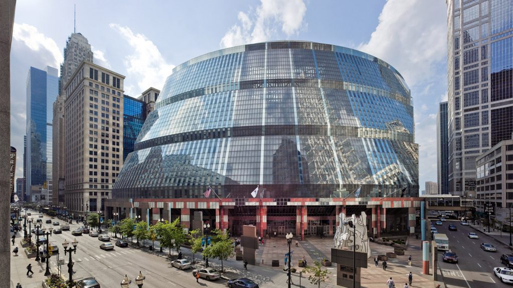
Interestingly, this building completely denies what I wrote about Jahn’s care about the energy efficiency of buildings. As the building’s exterior is mostly glass and the facade is at an angle it lets in a lot of sunlight. Hence a very complex and expensive to operate air-conditioning system had to be installed to keep the building cool in the summer and warm in the winter. This issue originates in Jahns stubbornness about the materials; originally, the panels were supposed to be made of curved and insulated glass, but this was blowing up the project’s budget. Another proposal was to use flat, insulated panels, which Jahn refused. So it ended with single-paned, uninsulated curved glass being used, hence the temperature problems.
It makes one wonder if, since 1985, the amount of money spent on operating the air-con system would not have paid for those insulated, curved panels. We can only guess…
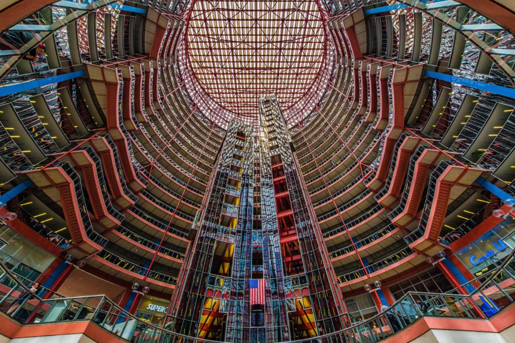
The building opens into an internal courtyard, available to the public, giving a view into all floors of the building. The key message here is the openness and transparency of the government to its people. Given the cost of maintenance, the government has for a long time pondered the sale of the building. In 2019 governor J. B. Pritzker (of the architecture prize Pritzker family, a nephew of its founder) signed a bill to sell the building. This spurred the architecture community into action, as there is a very high risk that once the building is sold, it will be demolished.
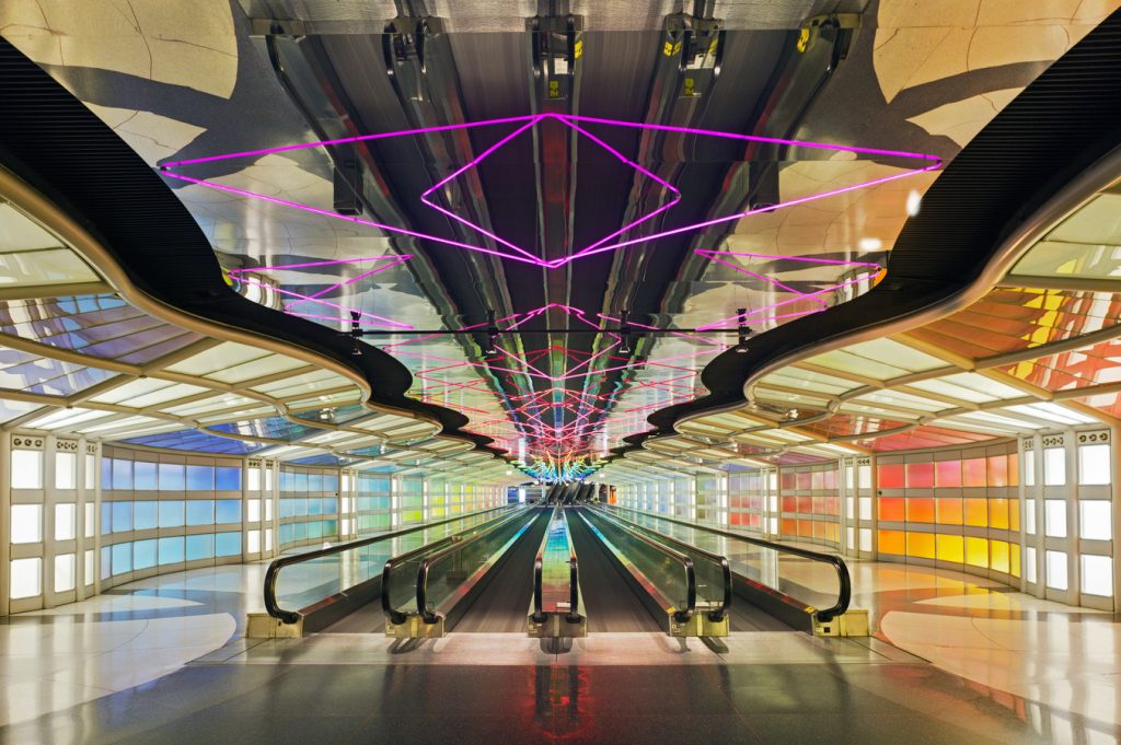
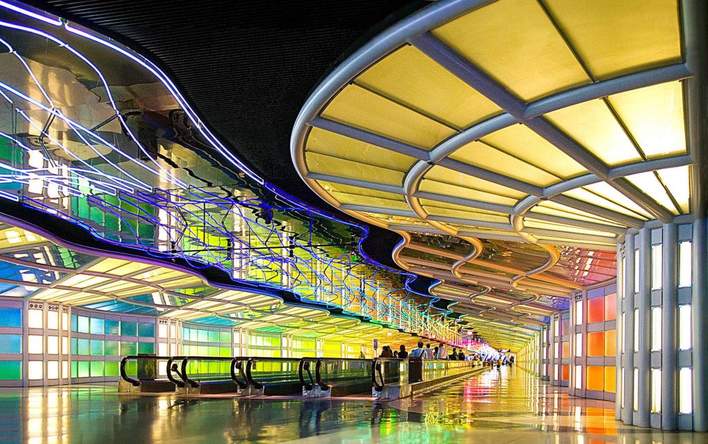
When Jahn was designing Terminal 1 for United Airlines, budget airlines did not exist. Flying and going to the airport was a serious and exclusive business. What Jahn was looking to do was to transform this experience into something for the future (how could he foresee the misery of budget flights?), and the terminal is often dubbed “The Terminal for Tomorrow.” The most famous part of the building is the tunnel between concourse B and C. Here Jahn cooperated with Canadian artist Michael Hayden to give us a completely new experience. Hayden created a neon installation, Sky is the Limit, that we’re immersed in as we proceed through the tunnel. To top that off, we’re accompanied by a slow-tempo version of Rhapsody in Blue. All that to make us feel very special and privileged that we can fly away.
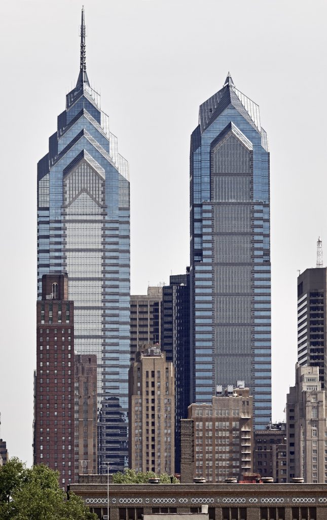
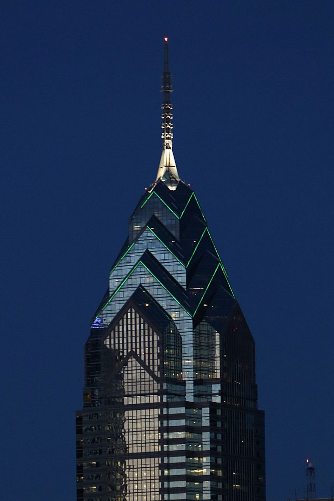
One journalist described the building, completed in 1987, as “the bodybuilder cousin of New York’s elegant Chrysler Building.” Not without merit, if you compare the two. One Liberty Place is only one of four buildings in the Liberty Place complex, we also have an unimaginative (in name at least) Two Liberty Place, a shopping mall, called Shops at Liberty Place, and a hotel that thankfully changes its name every time it changes the chain it belongs to.
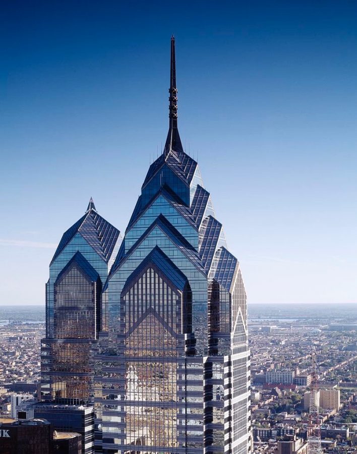
Still, it was One Liberty Place that caused the most controversy. Before the building existed there was a gentlemen’s agreement or a tradition that no building in Philadelphia would be higher than the statue of William Penn on top of the city hall. One Liberty Place most definitely is, so getting a construction permit took a substantial fight. Nonetheless, whether we like this “bully” of a building or not, it did become the first skyscraper in Philadelphia.
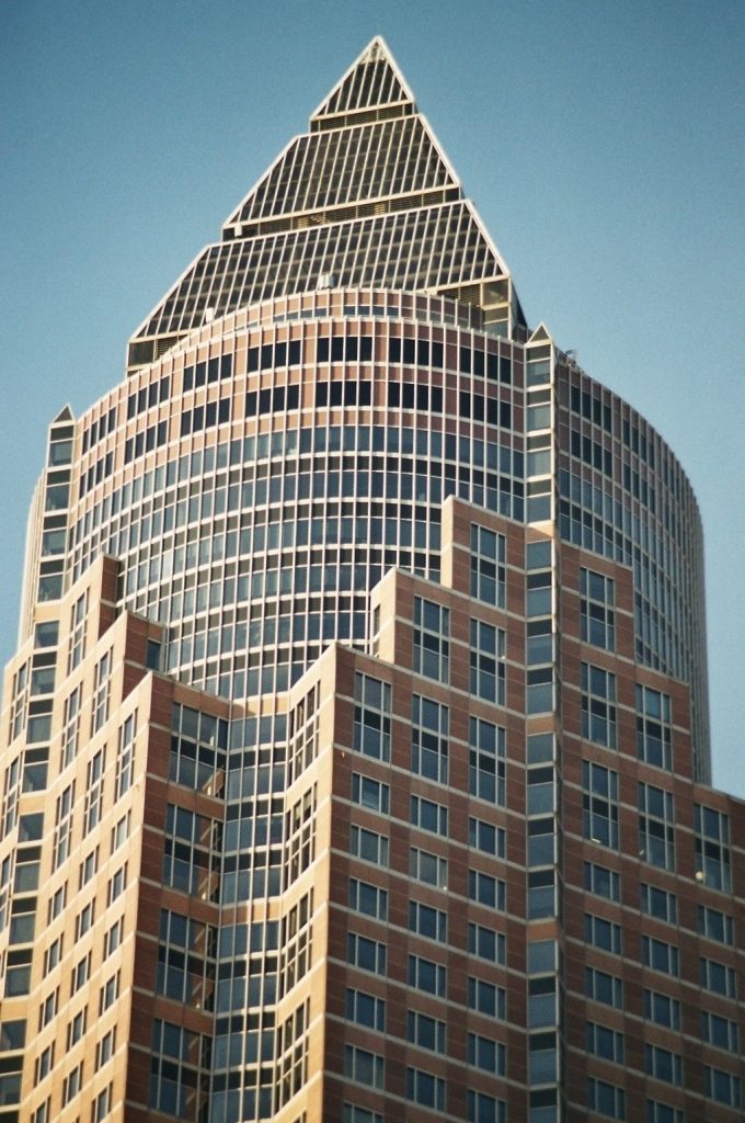
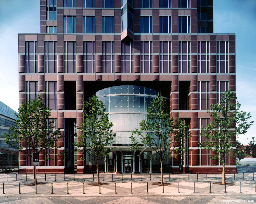
In the 1990s as a business in the US declined, Jahn turned his attention to the rest of the world, not least his homeland. Messeturm (or Trade Fair Tower) in Frankfurt was completed in 1991. The building’s distinctive shape earned it the nickname “the pencil” among the inhabitants of Frankfurt.
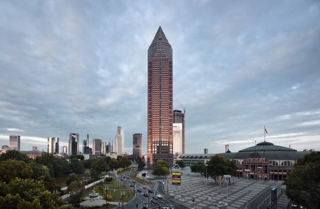
When it was completed, it was the highest building in Europe and managed to keep that title for six years, until 1997. It remains one of the few buildings in Germany that deserved its postal code. Also, when the building’s foundation was constructed, it set a world record for the longest concrete pour. For 78 hours, 90 trucks continuously poured the foundation’s concrete. As you can see, the building carries some of Jahn’s competitive personality in its history.
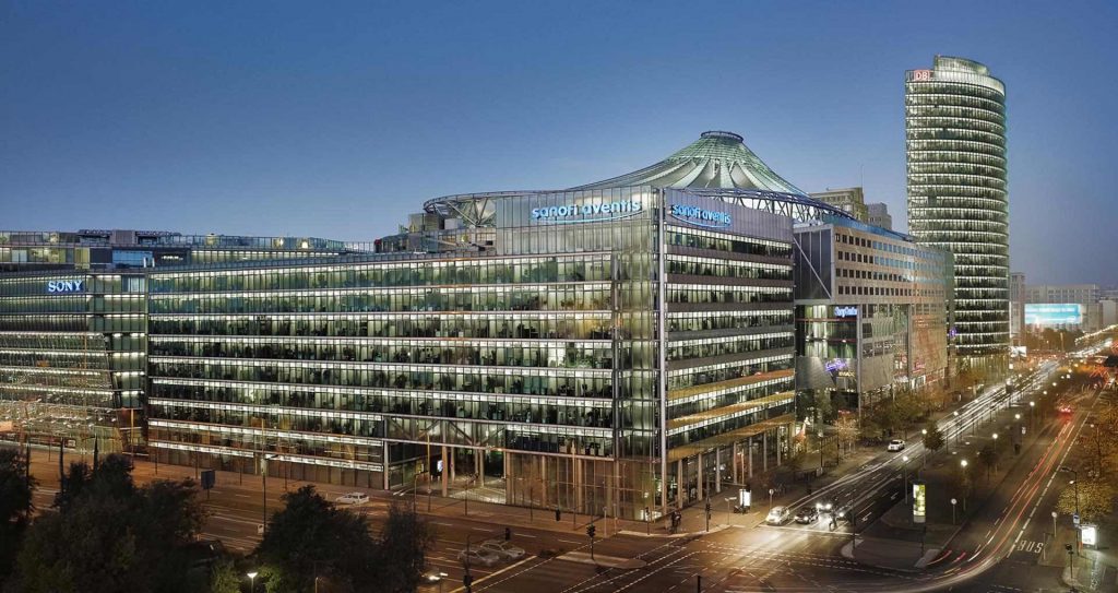
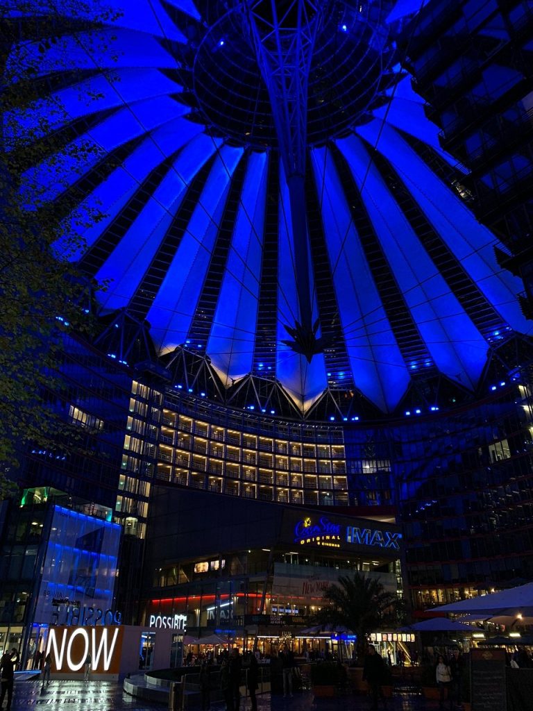
The Sony Center in Berlin, completed in 2000, goes back to the idea that Jahn explored in the State of Illinois Center. We have here a complex of eight buildings with a courtyard, the Forum, open to the public as the central space.
Potsdamer Platz, where the complex is located, became a no-man’s-land in the division of Berlin after World War II. But, after the fall of the Berlin Wall in 1989, suddenly it turned into prime real estate in the center of the newly united city. Sony bought the plot in 1992 and by 2000 the entire complex was ready.

Interestingly, within the high-tech buildings, we can also find a historical monument preserved at the explicit request of the city of Berlin. The Kaisersaal of the pre-war Grand Hotel Esplanade miraculously survived the war. In 1996 it had to be moved by 75 m, this feat was achieved using air cushions.
Probably the most characteristic feature of the Sony Center is the roof over the Forum. It is created from glass and self-cleaning, Teflon-covered fabric sails, hung on a steel construction supported by the nearby buildings, with a floating central point of support. Within the otherwise intimidating buildings of the center, the Forum creates a surprisingly friendly space to catch your breath and have a coffee or beer.
Postmodernism is an architectural style I always struggled with. Being a bit younger than its origins, I experienced its creations, for better or worse, throughout my life. Mostly for worse, let’s be honest. It is a style that has become an excuse for really bad architecture that was trying to be daring, witty, or ironic, and failed.
Now, this is my personal opinion and it may have to do with the timing because, by the time I became a conscious observer of architecture, PoMo was way past its heyday. And it doesn’t age well.
But let’s go back to basics. What is Postmodernism? I’ll defer to RIBA (Royal Institute of British Architects) for a concise definition:
Postmodernism is an eclectic, colorful style of architecture and decorative arts that appeared from the late 1970s and continues in some form today. It emerged as a reaction to Modernism and the Modern Movement and the dogmas associated with it. By the 1970s Modernism had begun to seem elitist and exclusive, despite its democratic intentions.
RIBA.
The founding text of Postmodernism is Learning from Las Vegas by Denise Scott Brown and Robert Venturi. It explored the architecture of a city traditionally rejected as the definition of kitsch and vulgarity.
Postmodernism breaks with the modernist focus on form as an expression of function. It drives a more human message. Away from the unattainable ideal, back to earth, back to the people and what they can relate to. It freely uses the architectural language of past centuries to deliver its message.
Jahn’s architecture carries all the traits of Postmodernism. He is not afraid of color. Jahn has no qualms about using a variety of forms to express the message he has in mind. On the other hand, his high-tech stylizations often do carry a remote echo of his early association with Mies van der Rohe. Jahn may be all for “decorating construction” but it is still construction that is at the heart of the matter. His version of Postmodernism is certainly a corporate take on the matter. He never hid his fascination with money and power and it rings loud and clear in his designs.
As an architectural style, Postmodernism is usually associated with the 1970s and 1980s. This was when it was defined and consistently applied as a style. If we boil it down to sole colors, free use of any traditions, and not being overly serious about things, then the style was over very quickly. On top of that, it was possibly one of the last clearly defined architectural styles.
The reason for this is in the heart of Postmodernism itself. Its plurality was a way of dealing with the growing and overwhelming plurality of the world and the exponentially exploding number of narratives, even the noise we now take for granted but which we are still not able to contain or grasp with our minds. This assumption itself, combined with the obsession with individuality, subverts any future attempts at creating a uniform architectural style.
And that is exactly the mark that PoMo has left us, long after it sold out to big money- the ability to do anything, which is as daunting as it is liberating, and which so often backfires in the public spaces of our cities, and so rarely succeeds.
We now have no direction, no one can tell us what to do. We are hardly bound by social expectations, we can choose our social circles and not interact with any others. In this world, everything becomes relative, including the symbols of status. And this is one thing that certainly bothered Jahn:
[…] look at corporate architecture. It was always iconic. But over the last decade clients are no longer interested in that. Look at Google or Facebook. […] They no longer consider architecture an artform. All they want is to have a roof over their heads. And they are no longer concerned with their image; in the past these people would wear stylish suits and now they run around in t-shirts.
Helmut Jahn in an interview with Vladimir Belogolovsky, 2018, Architonic.
DailyArt Magazine needs your support. Every contribution, however big or small, is very valuable for our future. Thanks to it, we will be able to sustain and grow the Magazine. Thank you for your help!