Masterpiece Story: Portrait of Madeleine by Marie-Guillemine Benoist
What is the message behind Marie-Guillemine Benoist’s Portrait of Madeleine? The history and tradition behind this 1800 painting might explain...
Jimena Escoto 16 February 2025
2 March 2024 min Read
Roy Lichtenstein was a famous American Pop artist, most well known for his original technique of mixed media on canvas, which was meant to remind the viewer of comic strips and movies of the 1950s. Lichtenstein’s work is full of visual parody and puns, and so is Artist’s Studio–The Dance, which, like a Chinese box, uncovers for us more paintings than one.
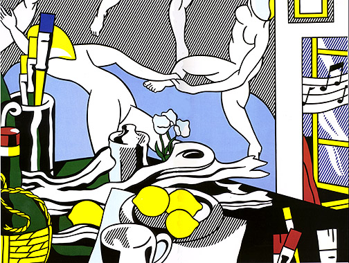
The theme of an artist’s studio is a common one across the centuries of art history. Almost everyone painted their surroundings, whether it was as a finished piece, or just as a simple study of drawing objects and using linear perspective. Roy Lichtenstein feeds on the tradition by showing us his own studio, which is, however, very and definitely purposefully two-dimensional.
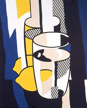
The space in the canvas is flat, making all diverse shapes appear to float. Only due to our rational minds do we understand that we see a table and a wall. A few of the objects are easy to distinguish, like paintbrushes, lemons, a mug, a flask, and a flower. But then we have a weird branch-like shape and three rectangles hanging or leaning over the wall. Are these a vinyl cover (with musical notes), a copy of a painting, and a mirror? These are my guesses, what do you think?
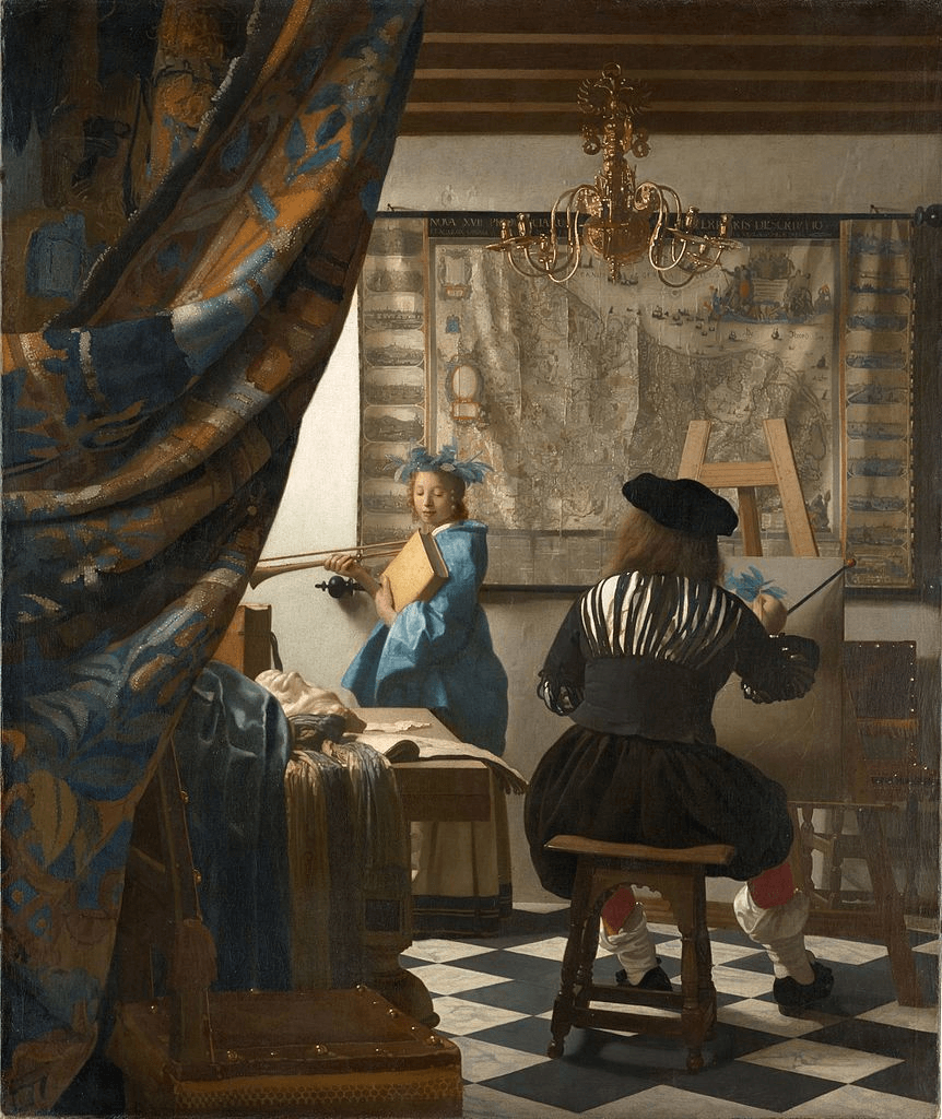
Although this painting is not a direct reference to Dutch painter Johannes Vermeer, I decided to use it as a comparison to show you how Lichtenstein pays tribute to the Art of Painting. This is the allegorical theme of Vermeer‘s famous work. While here the Art of Painting is personified, in today’s painting a few elements from other artists’s work compose it.
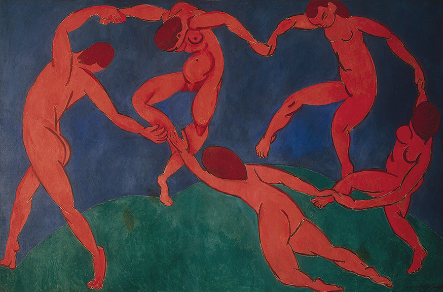
The first and most obvious reference is Henri Matisse‘s famous The Dance. It is in Lichtenstein’s typical colors and style, but still inherently Matisse. The centerpiece of the painting will be the first one to catch the eye of any more experienced art lovers. If you look closely, you can see that Matisse used one pair of complimentary colors: red and green. On the other hand, Lichtenstein used another pair of colors: yellow and blue. I doubt it’s a coincidence, rather a wink wink towards Matisse’s visual strategy. Matisse’s original work has a strong emotional impact on viewers. For example, some call it tribal, ritualistic, while others see it as an expression of pure joy of life. Was Lichtenstein a Matisse fan or he wanted to claim the authorship of The Dance?
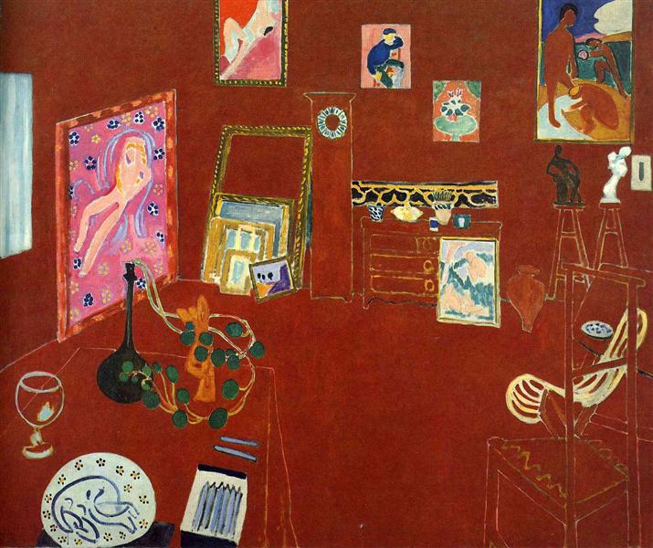
In reality, today’s painting is part of a larger series which every time presented Lichtenstein’s studio in a different light and with many imaginary elements. Henri Matisse’s paintings Red Studio and Pink Studio inspired Lichtenstein. Additionally, many of the works in the series contain specific references to Matisse’s imagery.
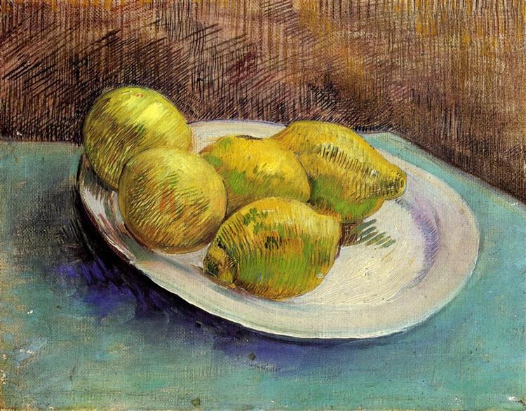
References of even such small elements like fruit and foliage from Matisse’s art are present. However, I decided to pick another artist to show you that not only Matisse could have been referenced in the case of lemons. A white plate and a simple table, that’s all that Vincent van Gogh needed to make a complete and striking in its simplicity work of art. Lemons were in fact a popular fruit in painting. For example, we can find lemons studied by Georges Braque, Edouard Manet, Moise Kisling, Claude Monet, and many many others.
So next time you hear somebody say that Pop Art is a superficial art form which did not contribute much to art, tell them about Roy Lichtenstein. Pop Artists knew what they were doing. By the means of parody and visual humor, they taught us about art history.
DailyArt Magazine needs your support. Every contribution, however big or small, is very valuable for our future. Thanks to it, we will be able to sustain and grow the Magazine. Thank you for your help!