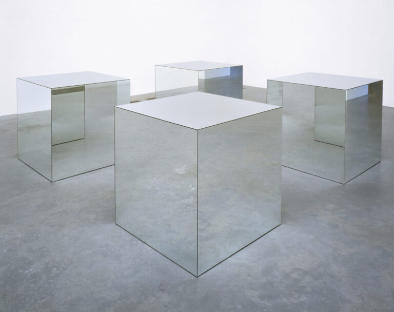
What do you get when you strip art of metaphor, representation, or metaphysics? It turns out that even if “what you see is what you see,” as Frank Stella put it, and there’s no “hidden meaning” in the piece, you can still make breathtaking art. On the occasion of Robert Morris’ birthday on February 9th, we’d like to show you some of Minimalism’s high points.
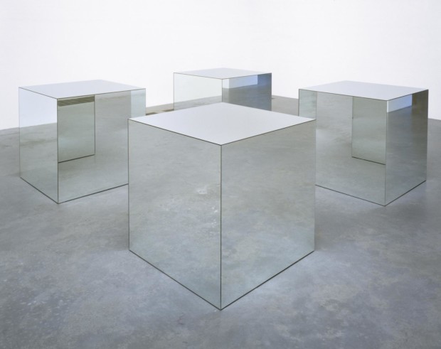
Minimal Art is not only about an object but everything surrounding it, including the viewer, his bodily presence, and movement. However, the scope of sensations is relatively narrow when it is made for the gallery or rests in the typical museum. In most cases, such a place is a so-called white cube—white walls evenly lit by electric light. A cold, calm beauty remains, like in Robert Morris’ work.
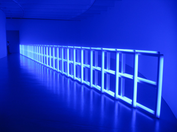
There are some ways, however, to transform such a place by the artist’s own means. The method Dan Flavin chose for that purpose was light. Ordinary neon tubes from offices and supermarkets are rigorously arranged, flooding gallery spaces with light and color.
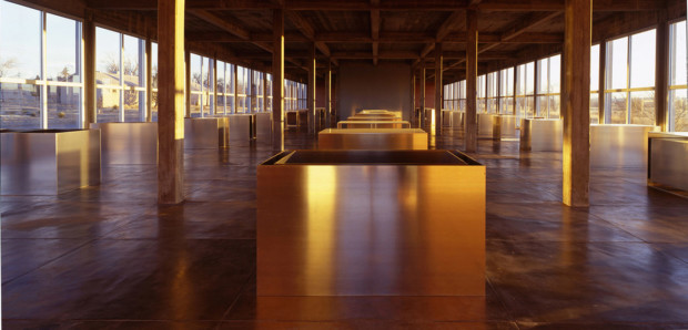
Light and color can also transform a work of art from the outside. In a Texas desert, Donald Judd turned abandoned artillery sheds into an exhibition site housing his untitled metal and concrete works. Simple, multiplied forms of industrially created materials are melted into their half-industrial, half-desert surroundings, changing their looks with every passing hour.
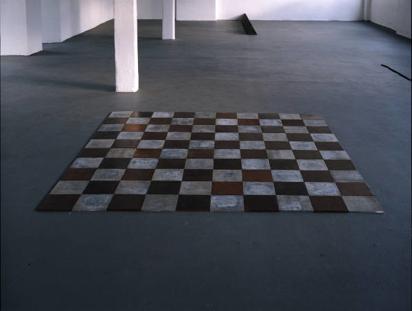
Carl Andre was deeply impressed when he first saw Stonehenge. It might not be apparent at first glance in his works, usually not grandeur by any means, but the impression of large, man-made structures is still present in his sculptures. Andre, a British representative of the distinctly American movement of Minimalism, strongly emphasized material. It could be modular, industrially made, but not as cold as Americans’ favorite sheet metals.
Andre used bricks and wood arranged in the shape of small cubes. He often focused on the ground. When he used metal, it took the form of a checkered floor. His art is all about attention to your surroundings. “Don’t we start on a floor when we’re infants?” Andre said once. “I just wound up where I started.”
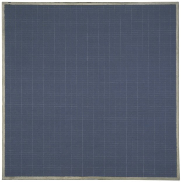
Agnes Martin was a real workhorse. Living most of her life in the seclusion of her house in New Mexico, USA, she devoted her life to painting. Not only did she paint every day, but she could paint one motif she imagined ten times over and over again. If she wasn’t pleased with the result, she destroyed every unsuccessful piece and started from the beginning.
She experimented for some time until she finally settled on the basic structure she used in her paintings—a grid. Like in Neoplasticist compositions, Martin used straight vertical and horizontal lines, stripes of color, and very pale, delicate lines. But they were without theosophic, spiritual undertones—just pure emotions.
Like many abstract painters, she referred to music, from which people don’t demand an explanation, just embracing pure emotions. And she was a true mistress of them. If we can compare her painting to music, it would sound more like the most subtle suites by Purcell, as opposed to, for example, the pompous Wagnerian tunes of Rothko.
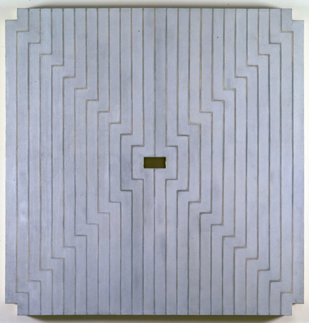
Frank Stella’s paintings from the late 1950s and early 1960s also featured strictly drawn rectilinear patterns, but the patterns’ principle lay in the painting itself, not the emotions it could express. Subordinate to the painting’s shape, they were meant to merge the perception of painting as an image and an object into one.
