Skiing in Art History
Artists have long captured the magic of snow. During the 19th century, when winter sports like skiing, skating, and sledding became more popular in...
Louisa Mahoney 5 February 2025
Did you know that since 1912 each Olympic host city has commissioned one or more posters to celebrate the hosting of the Games? Here’s our selection of (mainly vintage) posters created by contemporary artists for the Olympic Games.
Let’s start with the Tokyo 2020 Olympics. By the way, did you know that until 1948, art was an Olympic matter of judgment? Imagine meeting someone for the first time and hearing they’re on the Olympic team, only to learn that instead of running or swimming, they do their workout in front of the canvas!



Did you notice the reference to a famous The Great Wave off Kanagawa print by Katsushika Hokusai?
Each edition of the Olympic Games results in the creation of some special posters, serving mainly advertising or communication purposes. Posters commonly feature symbols such as the Olympic torch, colorful Olympic rings, or site-specific mascots/pictograms or places.


The colorful Olympic rings are the symbol that makes the official posters immediately identifiable. They represent the union of five continents and the meeting of athletes from all nations. The Olympic rings first appeared in 1928. Since then they have been used as a unifying element on all promotional or official materials.
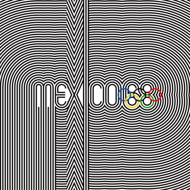
Although now there’s no real need to advertise the quadrennial Olympic event, during the early years of official contemporary games, the posters served an informational role. Radio or television ads directed to spectators and athletes were not officially used until the 1928 Amsterdam Olympics (radio ads) and 1936 Berlin Olympics (television ads). This meant that the promotion of the event relied mainly on print media. The official Olympics poster of 1912 was produced in 16 languages, which shows how important international distribution was.
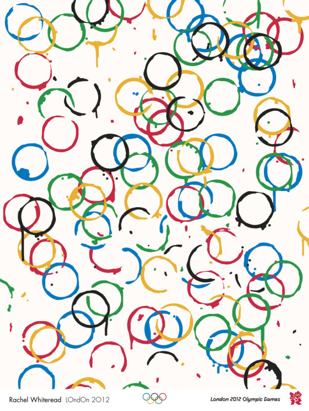
As already mentioned, there’s no real need to put the exact dates or geographical locations on the posters. These designs currently have more of a traditional role, giving contemporary local artists a chance to shine. Browsing through the collections of Olympic posters is indeed a great opportunity to see the evolution of design throughout the years, and national themes or styles.
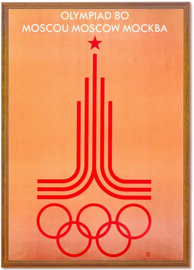
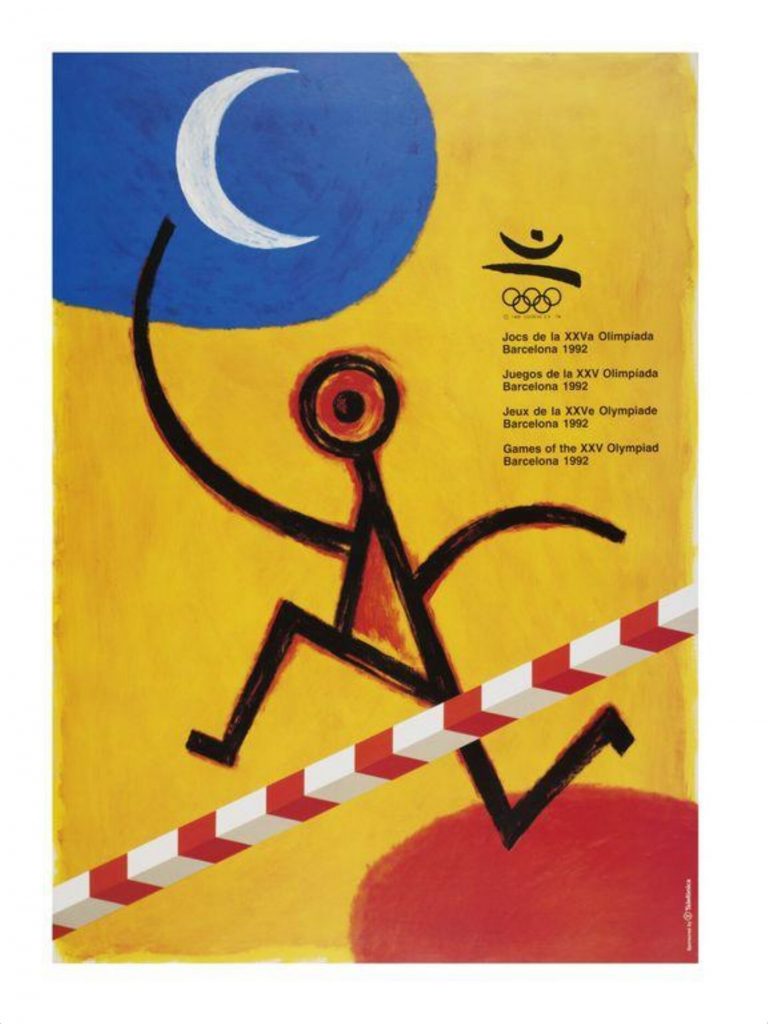
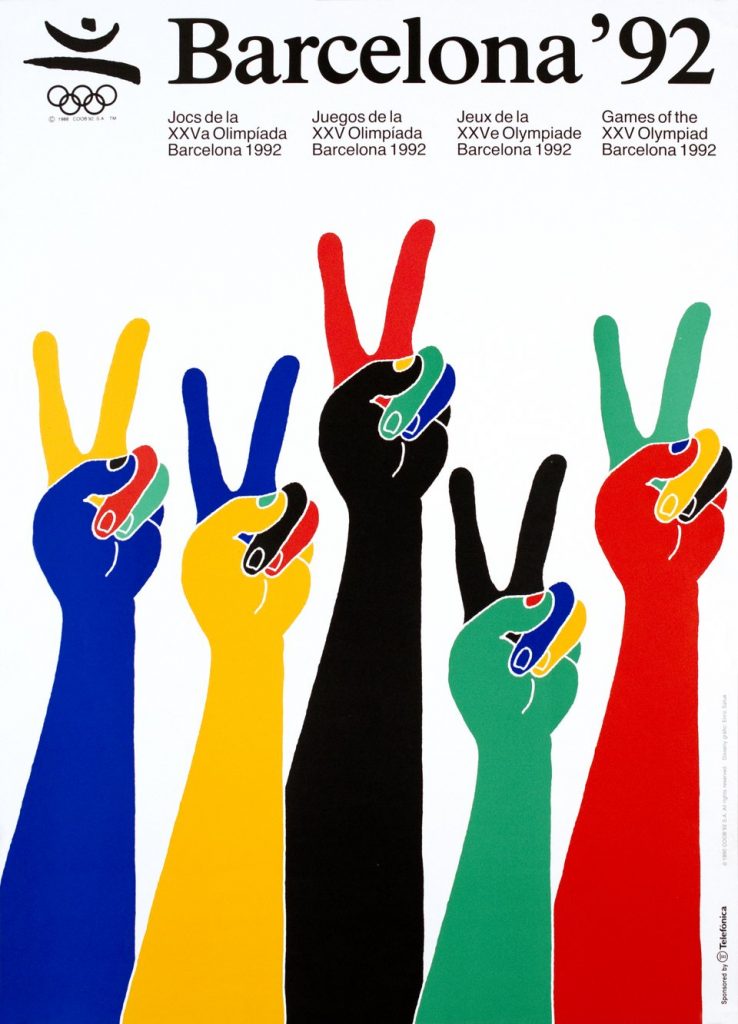
These Barcelona Olympics posters are a great example of “national” themes. Doesn’t this poster give you an instant Joan Miró feeling?
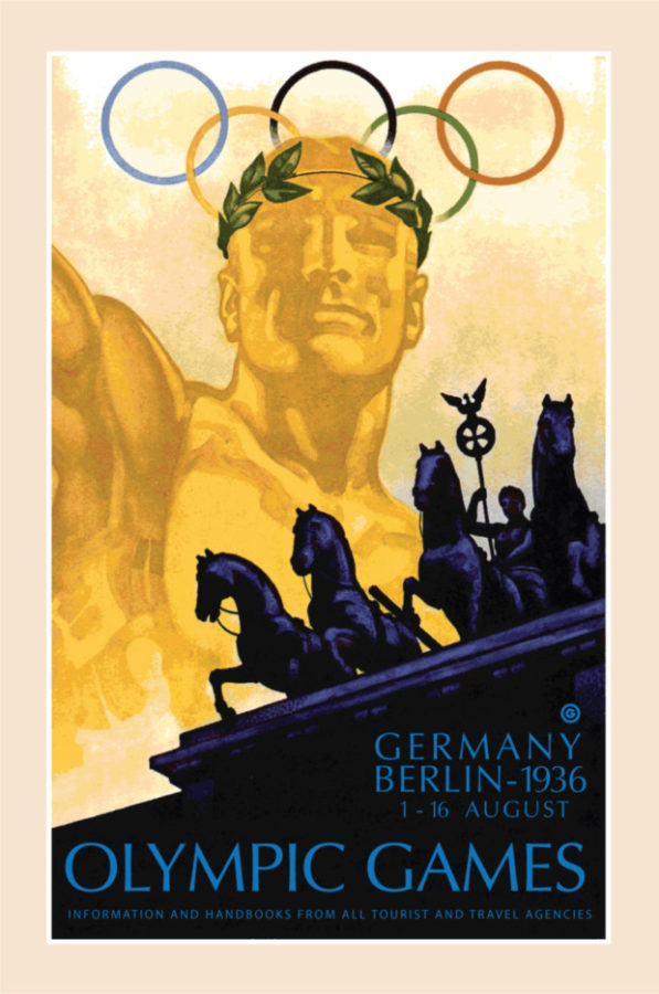
This Olympic poster promoting the games in Berlin has a strong nationalistic vibe. Look at the year – it’s not a coincidence. The figure of an athlete wearing an olive crown (traditionally worn by the victor in ancient Roman Olympic games) makes a gesture similar to the Nazi salute above the Brandenburg Gate in Berlin. This design only echoes the time and is similar to political posters produced in the late 1930s.
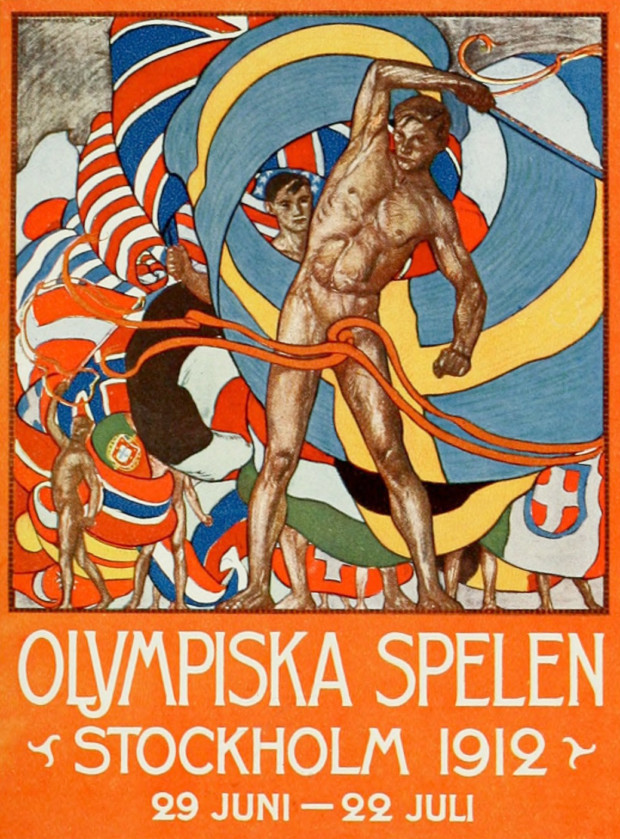
This poster for the Stockholm Olympics in 1921 caused a huge controversy due to the nude male figure in the front (the “strategically” placed ribbons were added later as partial censorship). It was even banned in several countries!
Which of these Olympic posters is your favorite? Let us know in the comments!
DailyArt Magazine needs your support. Every contribution, however big or small, is very valuable for our future. Thanks to it, we will be able to sustain and grow the Magazine. Thank you for your help!