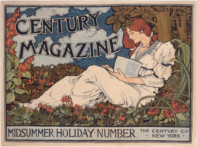
Publicity is all about hijacking your thoughts and stealing attention, yet some posters prove that it can be done in a beautiful and mindful way.
Wouldn’t it be great to be among art every day? Imagine going to work and passing art pieces being exhibited along the road, or walking by paintings on the way to the cinema or having a beautiful portrait smiling from the bus stop — a gallery to gaze at and comment on as you go along with your everyday routines…
Such a thing once existed and today’s throwback to the beginning of mass marketing will show you posters in art history.
Every day we are bombarded with publicity: from every corner visual pop-ups fight for ever more efficient ways of attracting our attention. In one second we are stripped of our own thoughts to be confronted with impossible body standards, unreasonably simple solutions, or promises of acquirable happiness.
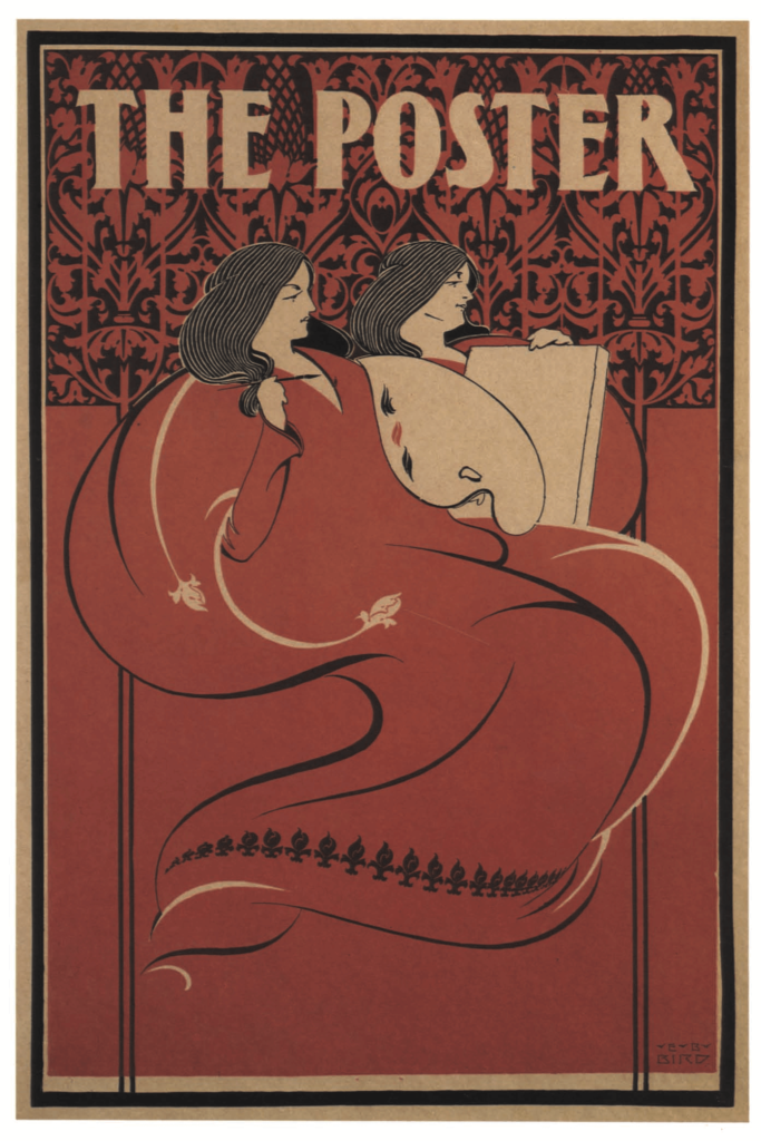
As the visual impact of this real-life SPAM is undeniable, since whole marketing teams work extremely hard to design these aggressive commercial campaigns — so why do they fail to make us feel like we live in a gallery?
Publicity today is more a shouting contest than a music competition, whereas posters in Art History used to draw attention to their innovation and visual attractiveness.
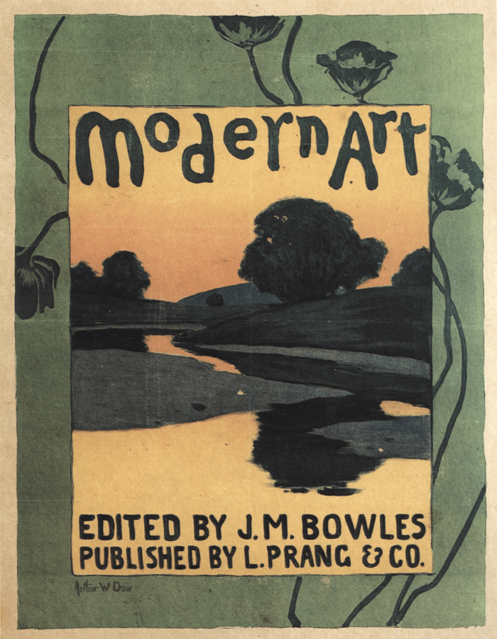
Posters have been sticking around since the birth of mass- production, carrying the essence of this paradigm shift: goods could be created fast and on a large scale, once inaccessible items were for the first time accessible to all kinds of people. Packed-up and ready to use items greatly contrasted with the hand-made unique and tailored ones that were believed to last generations. It didn’t take long for this new concept of convenience and disposability to reach the art world.
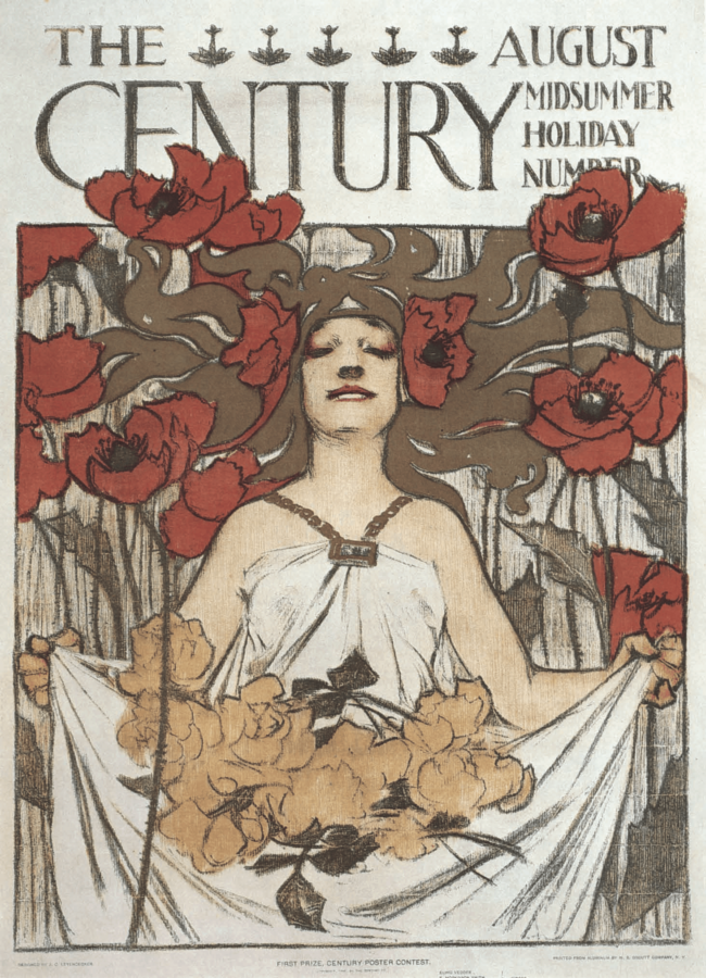
Broad consumerism set the tone for a new mindset. From the very narrow audience artists used to have, new opportunities started to emerge from this new need for the simple and standardized. Fuelled by the birth of a generalized public craving materialism, painters were commissioned to give life to brand logos, promoting products or events in visually stunning pieces that would undertake the same mass-process, printed and posted on walls and shop windows. This notion of multitude and immediacy granted the painters the freedom to experiment with non-traditional motives and techniques. Plus, in a market where everyone is competing, the bold gets the gold, and posters in art history were no exception.
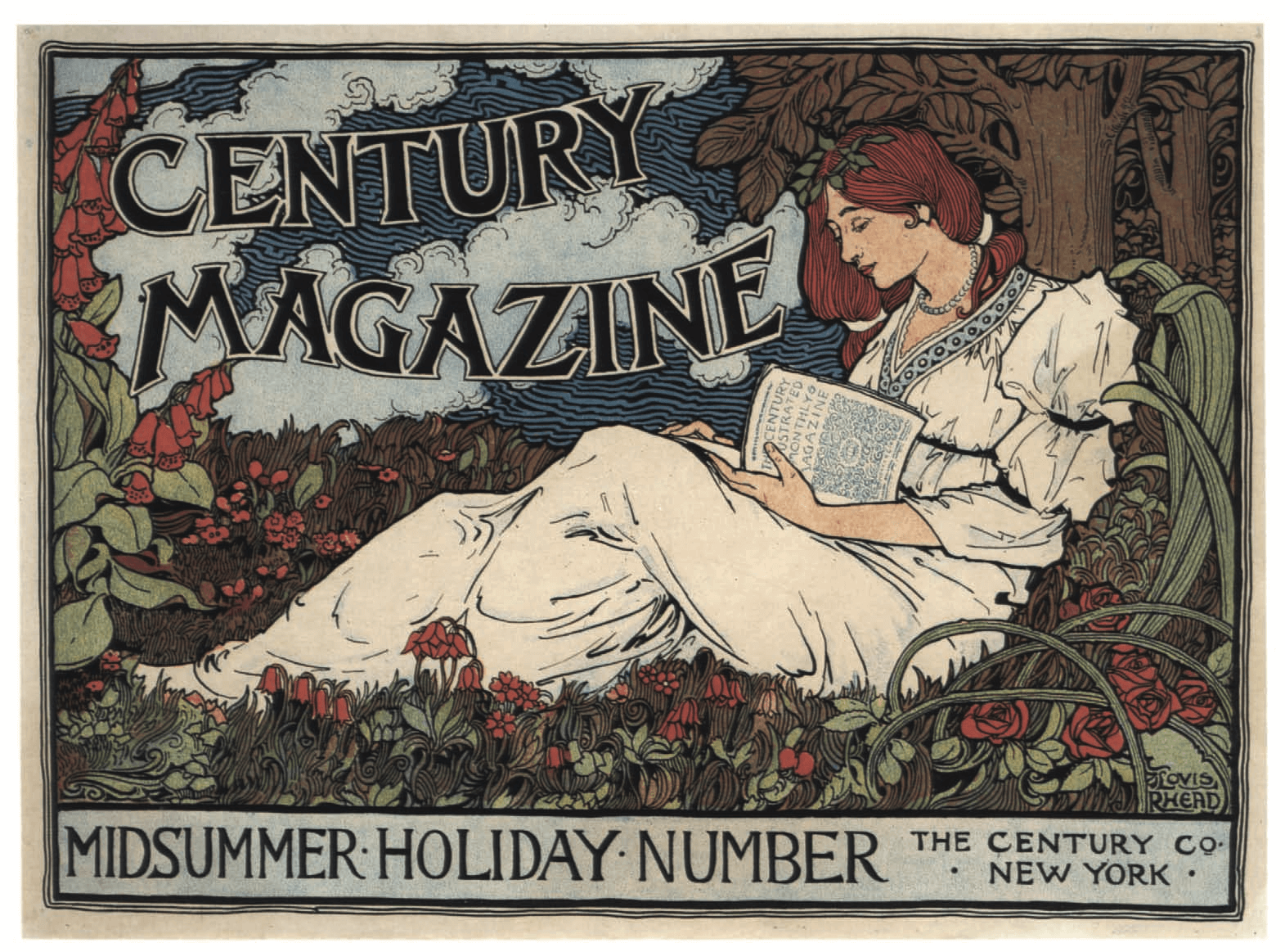
Soon enough the poster was so popular that such established artists as Pierre Bonnard or Henri-Gabriel Ibels, were making their own poster designs. Probably the most famous painter experimenting with this medium was Toulouse-Lautrec. Amid Belle Époque’s fluorescent atmosphere, this bohemian artist captured the seductive can-can dancers at the Moulin Rouge, the famous Parisian Cabaret.
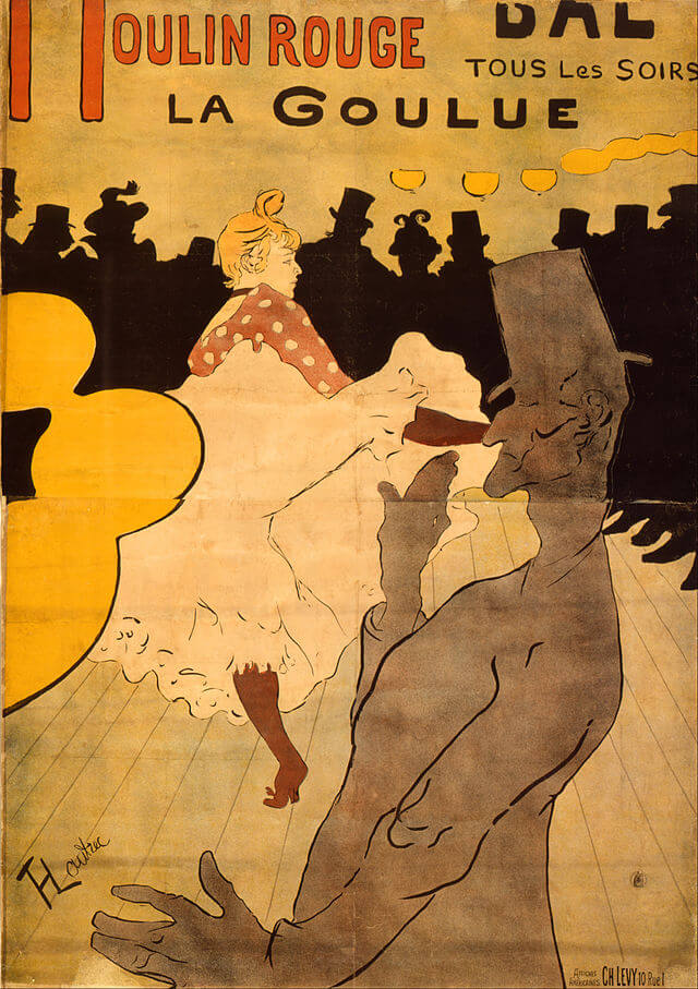
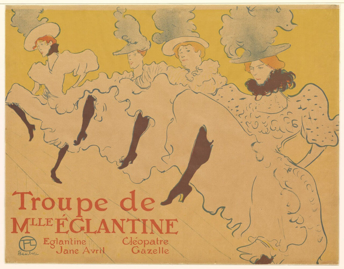
Fascinated by Parisian frenetic energy charged with erotism and alcohol, Lautrec developed, along with other creative bon-vivants, an exotic style inspired by the Orient, Japonism.
This style happened to be perfect for conveying a message, to this day it is possible to find Japonism’s decorative design lessons: clear lines, basic faded colors and easy to understand two-dimensional iconography.
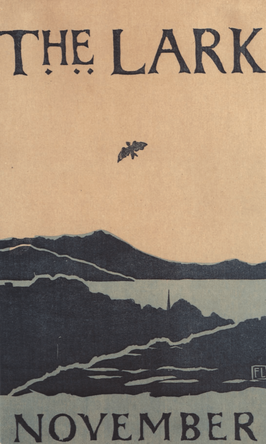
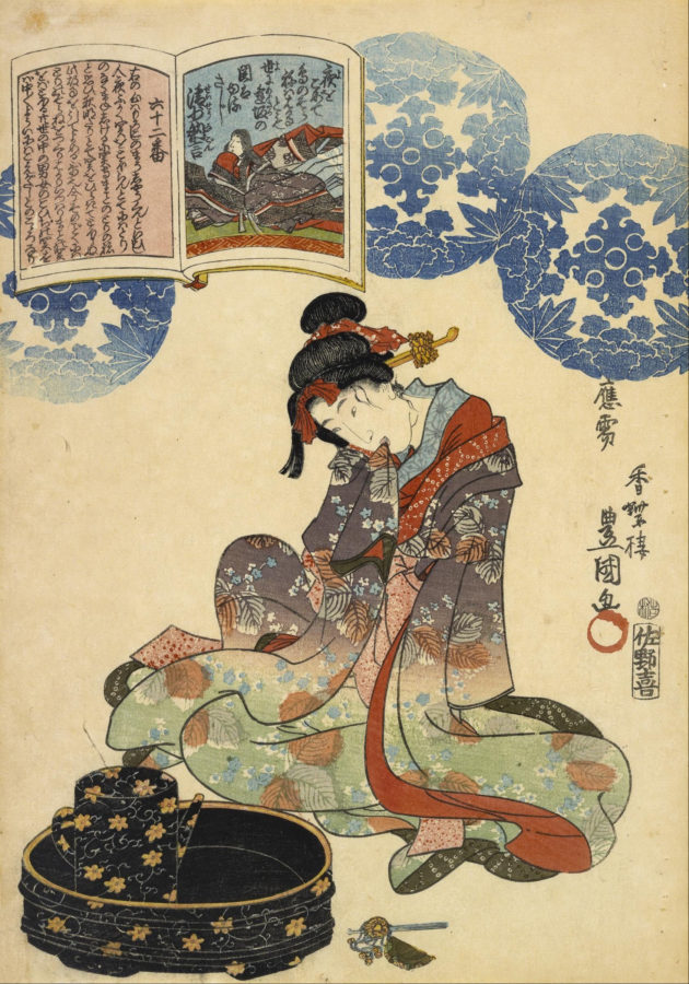
As these influences sailed half a world, they opened Europe’s eyes to a new pictorial reality, as the works by Katsushika Hokusai and Utagawa Kunisada brought a dare for change and simplicity, along with the tradition of incorporating written text and patterns in the piece, elements that would be crucial to the design of posters in art history.
Inspired both by Japonism and the Arts and Crafts movement, Art Nouveau bloomed with a unique style, deriving from nature the elongated structures of roots, the exuberance of flowers and the splendour of waves. This movement added sexuality and excitement to whatever the theme of the work was, and like the mass-production itself, it was always within reach — it was found everywhere, and as the first consumable art movement it was a sign of the times, spreading from decorative arts, architecture, interior design, to paint, and of course to graphic art.
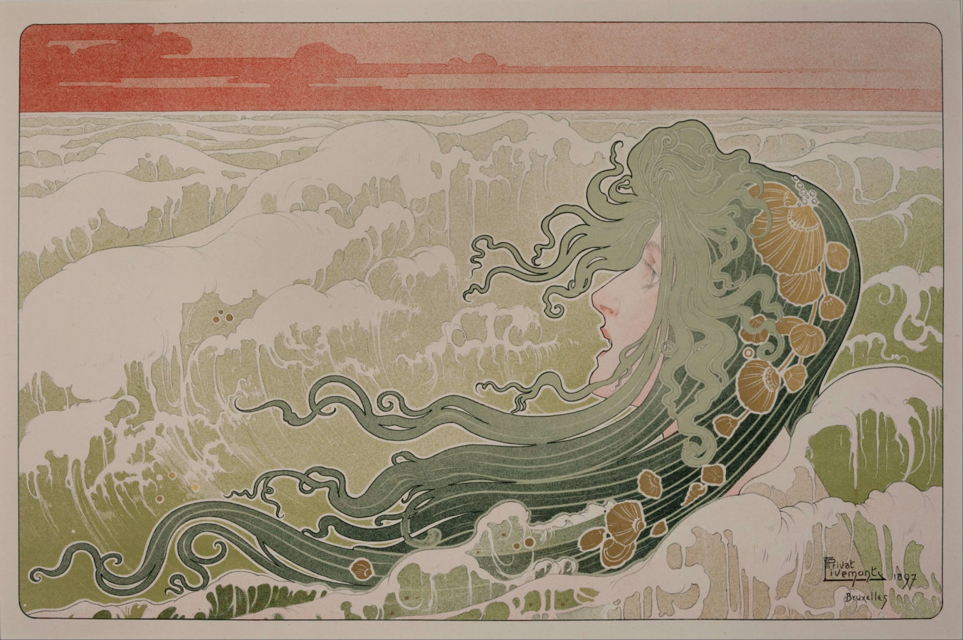
Posters in art history created a world of its own, developing a language of signs, fonts, colours and themes — the feminine form and figure, for instance, dominated among posters as a way of expressing elegance, attracting male attention and producing an impulse to acquire a product: I guess sex has been selling for a while.
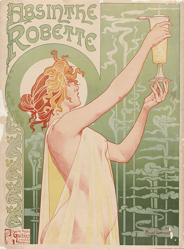
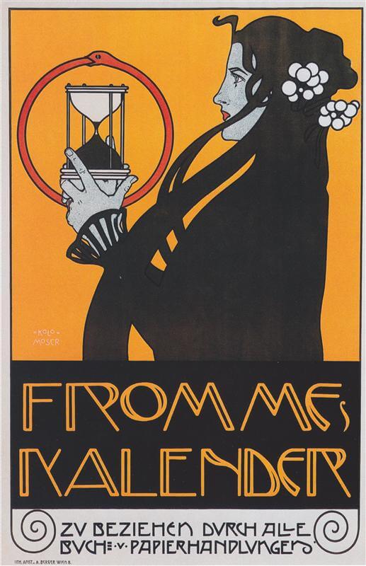
With the attention to finest detail and a vibrant use of color, Alphonse Mucha is probably the most famous among his fellow designers, immortalized by his artistic dedication to posters, developing his very own iconography that would extend way beyond publicity. Mucha represents the all-embracing influence of Art Nouveau: the street as a window to art; the ever-blurring line separating art from commerce; the all-embracing design of everyday life; and a targeted mass audience.
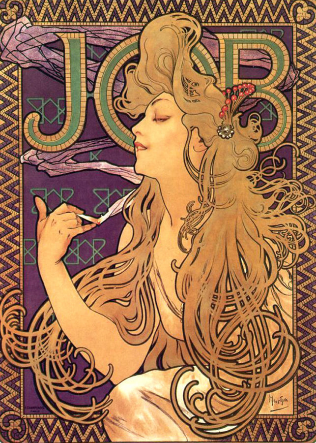
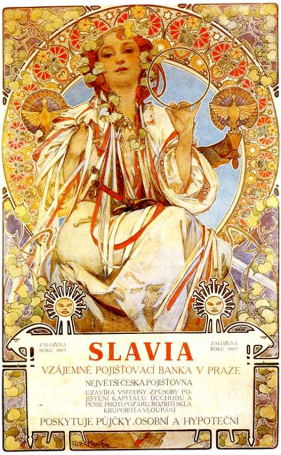
Noble Art-muses that for long have seduced observers into Greek myths or religious scenes are now trying to sell you soap and chocolate bars. A purist might argue that these are no themes worth of being recognized as Art, as they are meant to inspire not much more than a purchase. Yet if you choose to look at the question from a purely aesthetic angle, then there shouldn’t be any problems considering these beautiful creations as Art.
The answer to the “Poster as Art” problem gets more complex when we start to consider another great role played this medium: Propaganda.

Visceral, fearful and masculine themes overtake the seductive, vibrant colors of commercial posters. Crafted to impose the political agenda, or to challenge the established system, propaganda aims to manipulate, reinforce or change a social view: in their case it’s the “Truth” that is being publicised. Especially in one- party regimes, where society is driven by one official Ideal, it’s essential to make people believe in it.
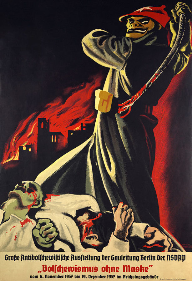
The Reich Ministry of Public Enlightenment and Propaganda was, during Nazi Germany, an agency headed by infamous Joseph Goebbels. Far from only enforcing ideology by posters, the ministry supervised all aspects of culture and the media: choreographing the megalomaniac appearances of the state, cultivating the personality of the führer, censoring and intimidating all the non-conforming media. A dark page for posters in art history.

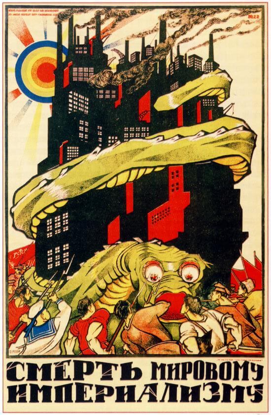
The Soviet Department for Agitation and Propaganda, later renamed Ideological Department, developed a distinguished and unified style across media — theatre, cinema, pamphlets and of course posters. Soviet propaganda targeted the minds of the people, although with a wider range of objectives: the Soviets showed what a perfect comrade would look, act and think like; people were educated about the projects, values, and goals of the regime; and there were even posters regarding practical things such as agriculture methods.
Propaganda, although one of the common denominators of autocracies, is not exclusive to them. Especially during World War II, the North American government undertook a great campaign to support the Allies’ victory — around 200,000 different designs conveyed messages of glory and encouragement, promoted home efforts and spread the news from the front.
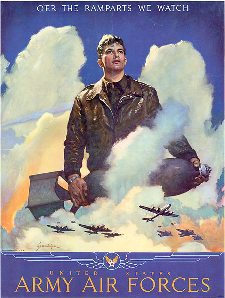
To consider these propaganda posters in art history as Art, we have to ask ourselves about their role as a tool. While Art Nouveau posters sought a sense of beauty traditionally pursued by art, propaganda posters many times neglected aesthetics for a more functional way of conveying the message, with as little room for interpretation as possible. They worked less as something to wonder and gaze at, and served more like a mind-hammer, designed to perform a single meticulous task regardless of reflection.
There are no authorities in Art, as art itself works as a way to challenge its own definitions, yet some people devoted their lives to think about how it would be better for us to view it: few of those thinkers established Art as an entity, as Free and Beautiful. For example for Oscar Wilde, who was an advocate of Aestheticism, art must be useless, as it aims to simply create a mood, to induce pleasure and contemplation (both towards the self and the object), meant to be a gift of wonder:
A work of art is useless as a flower is useless. A flower blossoms for its own joy. We gain a moment of joy by looking at it. That is all that is to be said about our relations to flowers. Of course, man may sell the flower, and so make it useful to him, but this has nothing to do with the flower. It is not part of its essence. It is accidental.
See this fragment here and here.
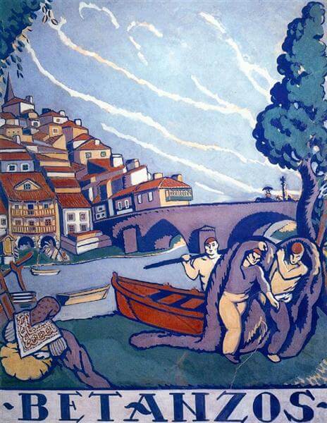
Today’s posters resemble more propaganda, as they leave us with less and less space for contemplation and admiration: they are brute injections of impulse and desire, crafted to target directly the unconscious, thus they avoid the step of interpretation — the observation is stolen from us as the brain is flooded with messages we don’t need to process. We don’t take pleasure from them as we feel invaded.
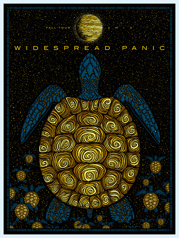
The revolution that set art free from the confinement of galleries was subverted: once art was only for those who had the money, now publicity is coming to those who don’t: people are no longer empowered by being part of the mass, as we are alienated by an overwhelming number of contradicting offers always fighting for our desires and attention.
My personal thought on a possible solution is to get the personal element back in designing posters, just like posters in art history suggest — not this abstract, amorphous mixture of random elements, without a movement or motive. Alienation feeds on the visual chaos and so a new publicity movement would need to go back to previous movements and bring creativity closer to us. It should care about the consumer and their aesthetical well being, which would make one feel less anxious and more pleased to be around publicity.
Find out more:
- Best Party Posters of 19th Century
- 13 Most Beautiful Posters of Alphonse Mucha You Must Know
- In A Cabaret With de Tolouse-Lautrec’s Posters
[easyazon_image align=”none” height=”160″ identifier=”0857752545″ locale=”US” src=”https://www.dailyartmagazine.com/wp-content/uploads/2018/03/61UDwnK8ygL.SL160.jpg” tag=”dailyartdaily-20″ width=”145″] [easyazon_image align=”none” height=”160″ identifier=”0815000308″ locale=”US” src=”https://www.dailyartmagazine.com/wp-content/uploads/2018/03/51T7WW5HaxL.SL160.jpg” tag=”dailyartdaily-20″ width=”123″]
