Lotus Temple and the Bahá’í Faith
The Lotus Temple is renowned for its distinctive lotus shape. A prominent Bahá’í House of Worship in New Delhi, the temple embodies...
Maya M. Tola 27 January 2025
The announcement to replace the slippery glass panels on Ponte della Constituzione bridge in Venice, designed by Santiago Calatrava, made me realize that European cities are peppered with bridges designed by this architect and I had a chance to see quite a lot of them, as many of you probably have. Here is my selection.
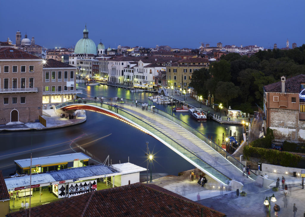
This beautifully lit, light modern bridge has caused a lot of controversies. There were many reasons for this, one of them being its modern form, that many people felt did not match the surrounding architecture. Another was the lack of disabled access; this issue was addressed but at a substantial cost. Speaking of cost, the construction of the bridge was nearly twice the planned amount. Yet another problem was the slippery surface, caused by sixteen glass panels. Finally, the City of Venice decided to replace them, due to too many accidents. Despite all those problems, it is difficult not to admire this elegant ribbon of light gently floating above the canal. Regretfully this is the only bridge on this list that I have not had a chance to see.
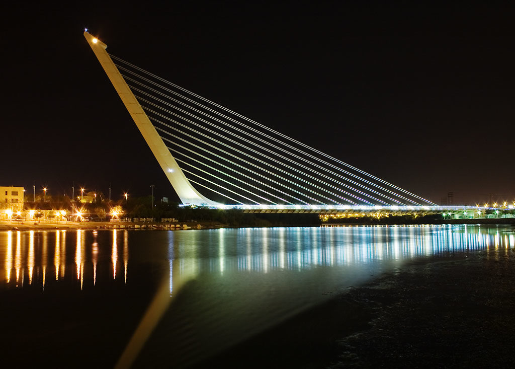
This bridge has been constructed as part of the city preparations for Expo’92. The original idea was to build a pair of cantilever spar, cable-stayed bridges, but political and economic realities allowed only for one. This does not change the fact that it is still a striking feat of engineering. Calatrava decided not to use the traditional stay cables on the other side of the pylon to stabilize it, only its weight, a true balancing act. Through this, he achieved a sense of fragile stability, dependent on both the pylon and the deck. Challenging our idea that it is always the pylons holding the bridge together.
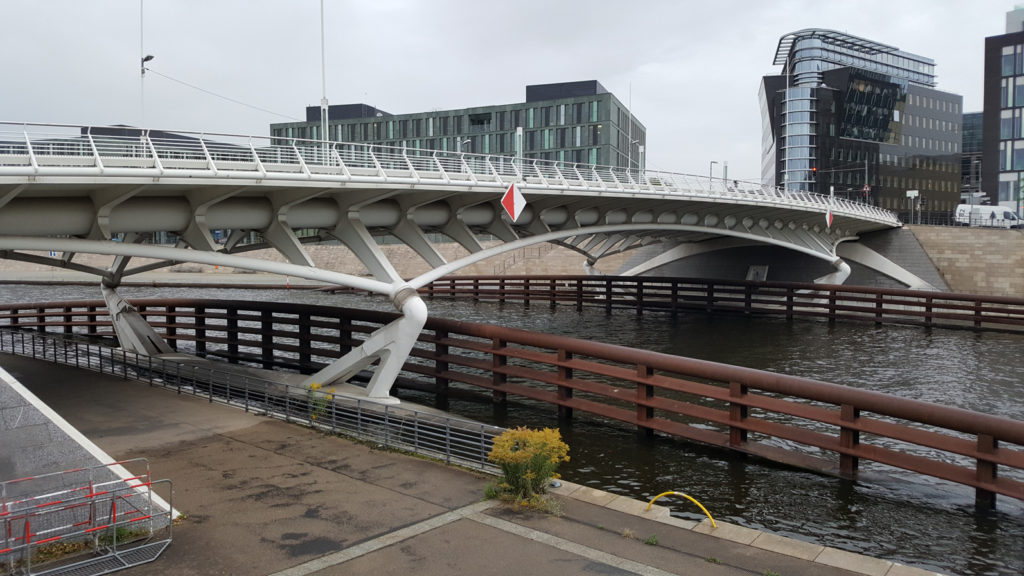
For a change, this is a very unassuming bridge, easy to be missed among other more flamboyant bridges designed by Calatrava. It was one of the first east-west connections restored after German reunification, a symbol of the country coming back together. What makes it stand out from other Calatrava bridges is the fact that it does not boast an extravagant structural feature over the deck, the intrinsic construction is all under the surface. In comparison, it does feel very sensible and almost humble. Originally, it boasted special lighting features, but those significantly increased the cost of maintenance and have fallen into disrepair since.
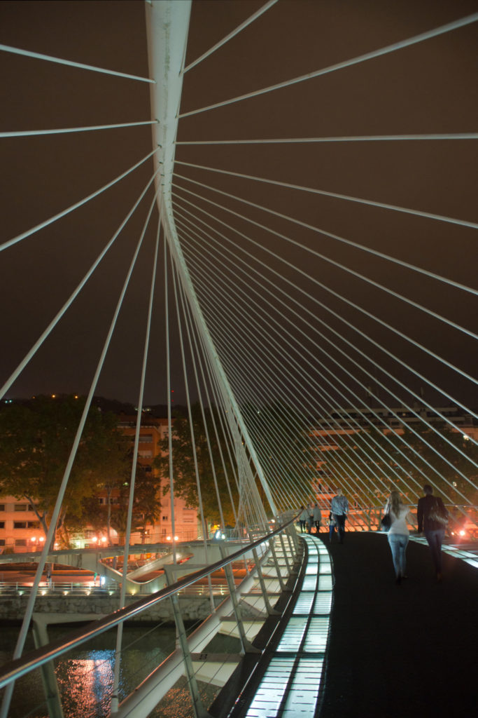
Zubizuri means “white bridge” in Basque, and it is true of nearly all Calatrava bridges, they are painted white, which makes them stand out from any background in a beautiful way, but also significantly increases the maintenance costs. Zubizuri is a pedestrian bridge giving access to the famous Guggenheim Bilbao. Like Ponte della Constituzione, it also had glass bricks, causing the same problems in wet weather. The bridge also caused a conflict when the local authorities allowed Arata Izosaki to build a new footway from the bridge to improve its connection. Calatrava took the matter to court. An interesting dispute over the creator’s moral rights vs. the owner’s rights ensued. The bridge again plays with our perception of stability with its off-kilter main arch.
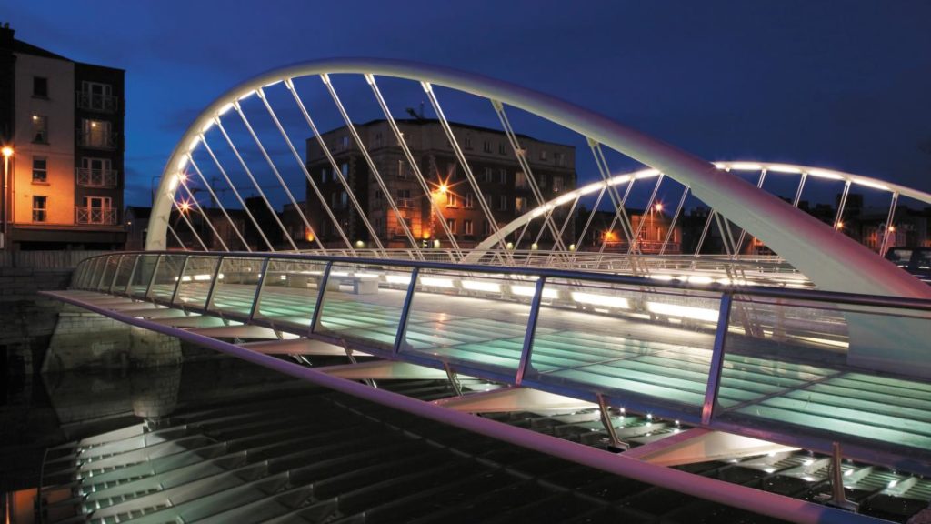
Here yet again Calatrava toys with our perception of a “stable bridge”. The two arches supporting it lean outwards invitingly when we approach the bridge. However, when seen from the side, the perspective makes the arches seem straight. This time, Calatrava decided to keep the glass to the side, creating a parapet next to the pedestrian walkway. Which is probably for the best.
The bridge has benches, allowing people to sit and admire the banks of river Liffey. Thanks to this, it turns from a purely transitional place into a more social space, it is not only the means but may also be the end.
Again, Calatrava designed ingenious lighting features, which make the bridge striking at night without interfering with its aesthetic consistency. It is a beautiful blend of form and function, not too over-the-top, but also not plain. It could not all be so easy though; the construction was delayed by six months and went well over the initially planned budget.
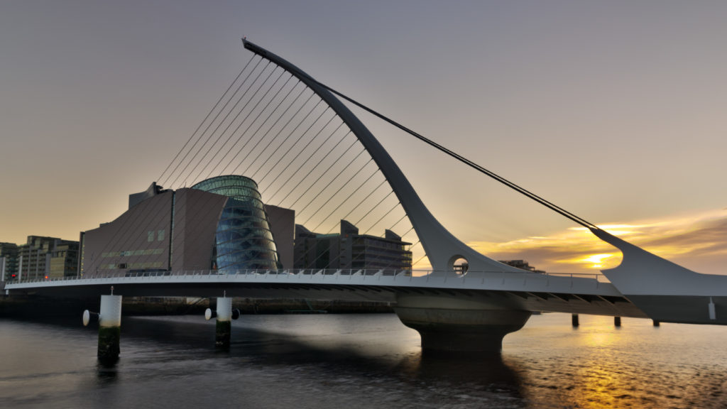
This bridge, on the other hand, is a statement. It is a bold, extravagant, almost arrogant statement on what technology and construction can achieve. The inspiration for it was the shape of a harp, which is rather self-explanatory. It is stunning in many ways, for example, it has been constructed in Rotterdam and delivered to Ireland on a barge, whole, not in pieces.
The other interesting feature is that the bridge rotates by 90 degrees to allow ships to pass, every time creating a spectacular show.
Calatrava, of course, designed many other bridges, so this is just a sneak peek of his oeuvre. The purpose of a bridge is to connect, but his bridges seem equally often to cause conflict. Often built way over budget, incurring high maintenance costs, yet visually striking and quickly becoming a landmark. Which one do you choose, sense or sensibility?
DailyArt Magazine needs your support. Every contribution, however big or small, is very valuable for our future. Thanks to it, we will be able to sustain and grow the Magazine. Thank you for your help!