The sculptures of Constantin Brancusi remind me of being in a sketch class with a model posing. When the length of the poses are one minute, even two minutes, I haven’t the time to draw a detailed rendering of the figure, modeling form from dark to light, making sure the proportions are accurate, etc.
I am often seated too far away from the model to be able to get a likeness of the model’s facial features. All I am able to do in the time allotted me, with the assistance of the thin piece of vine charcoal that I gently hold in my right hand, is to try to capture the model’s gesture. I am not drawing what the model looks like; I am drawing what the model is doing. I feel the pose in my own body and use that feeling to make long, sweeping strokes onto the newsprint pad in front of me.
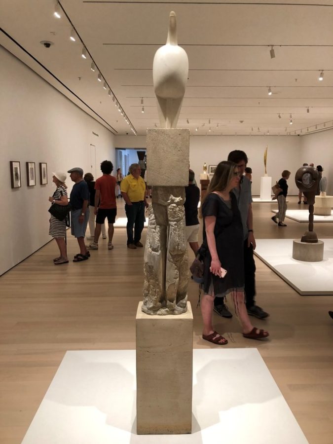
This is what I believe Brancusi did, except Brancusi’s medium is sculpture. Instead of modeling in clay as many of his contemporaries were doing, Brancusi chose instead to carve his forms out of stone and wood. Many examples of Brancusi’s ‘gesture sculptures’ are on view on the second floor of the Museum of Modern Art. The exhibit is contained in a large, spacious room. The museum was especially crowded on the first hot, humid Sunday in August. This meant that, for me, the museum-going crowd was too noticeable a presence throughout my attempts to immerse myself in the sculptures. At the same time, this overflow of people added to the mood and the excitement of the experience.
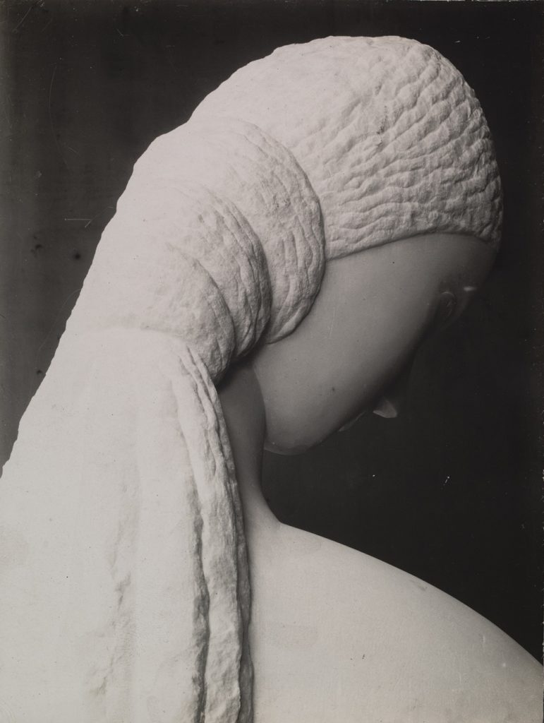
When I am trying to look at paintings in a crowded room, navigating myself into position in front of each painting, once I am able to do so, if even for a few moments, the crowd almost disappears and I am able to enjoy the painting, isolated from its environment. Sculpture does not enable the viewer to isolate itself from its environment because the idea is to walk around each sculpture, so other people are always visible in a crowded room, and nothing can be done about it.
MoMA’s description of Brancusi’s work includes the following passage:
With a vocabulary of simplified shapes, he created visually reductive works that evoke rather than resemble the subjects named in their titles, pushing form to the threshold of abstraction.
The irony is that Brancusi’s ‘visually reductive works’ evoke their subjects in a more satisfying way than a more literally made sculpture is often able to do.
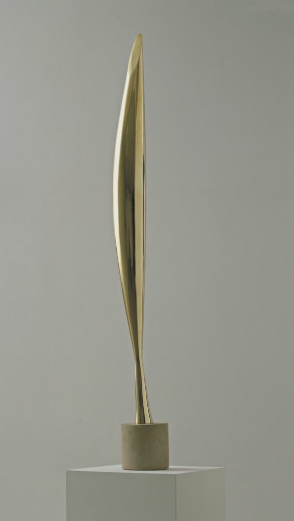
An example of this is ‘Bird in Space.’ One of the two versions of this sculpture in this exhibit is from 1928; the other is from 1941. Starting in 1923, Brancusi produced nine ‘Birds in Space.’ Each one is unique, even though the basic approach each time is the same. The viewer has to look up at this bronze sculpture in the same way one looks up at a bird in flight. The movement of the bird, because of its imagined grace, its distance from the viewer, and the speed of its movements blurs the details. The shine of the bronze is reminiscent of the brightness of the sun. And the shape of the sculpture has a lightness about it because it is thin and airy. The main shape of the sculpture could either be a wing or the movement of the entire bird. The base of the bird is thin, also adding to the lightness of feeling. What appears arbitrary at first glance becomes a piece that is well thought out upon reflection.
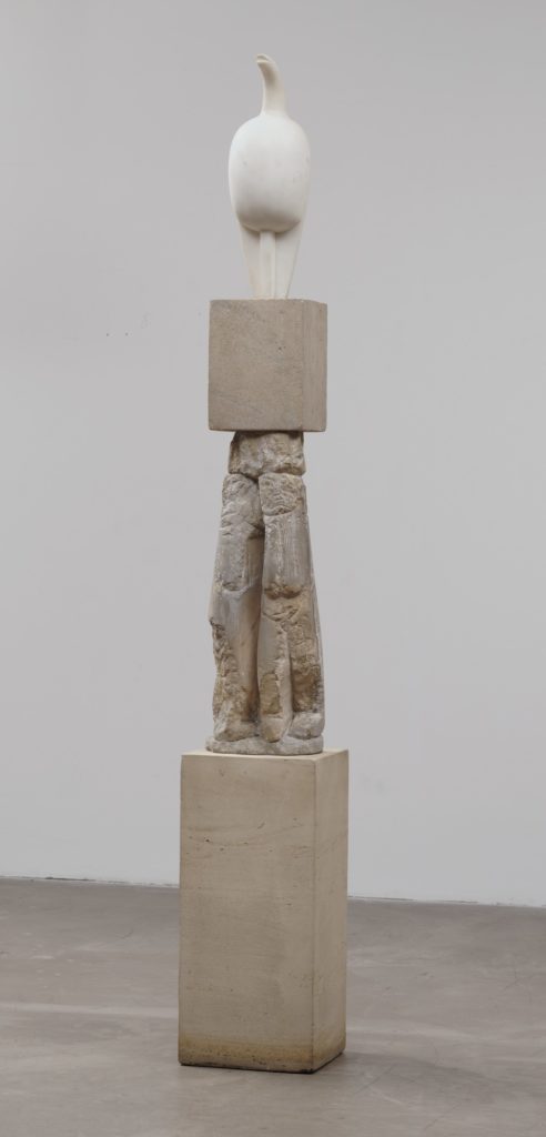
Brancusi’s style evolved over the years. When one compares ‘Maiastra’ from 1910-12 to the ‘Bird in Space,’ one can see this evolution clearly. ‘Maiastra’ is a much more literal representation of a bird. MoMA explains that this piece is Brancusi’s first sculpture of a bird. The interaction among the different materials that make up this sculpture, which includes the pedestal it is resting upon, is where my eye tends to go. With the ‘Birds in Space,’ my eye follows the imaginary flight of the bird.
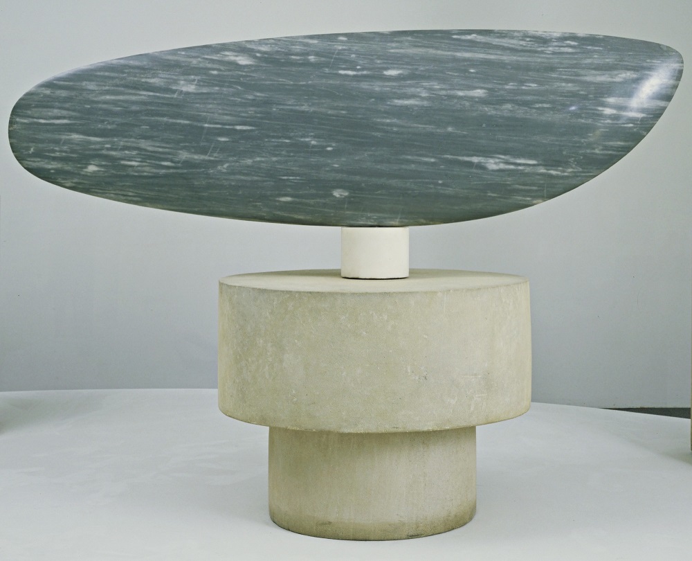
Motion with Brancusi can either be horizontal or vertical. ‘Fish’ from 1930 is made from blue-gray marble and feels like a fish moving quickly through water. We are so used to thinking of an object as still, frozen in time, that an adjustment in thinking is required and made. When an object moves quickly, the details are blurred and often simplified. Here Brancusi manages to accomplish both. The irony is that the object’s movement through space is now dependent upon the movement of the viewer walking around it, even though, at one time, the sculpture rested on a pivot that enabled it to rotate through space.
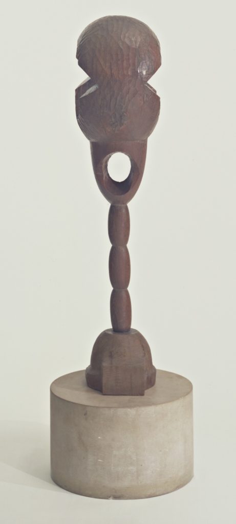
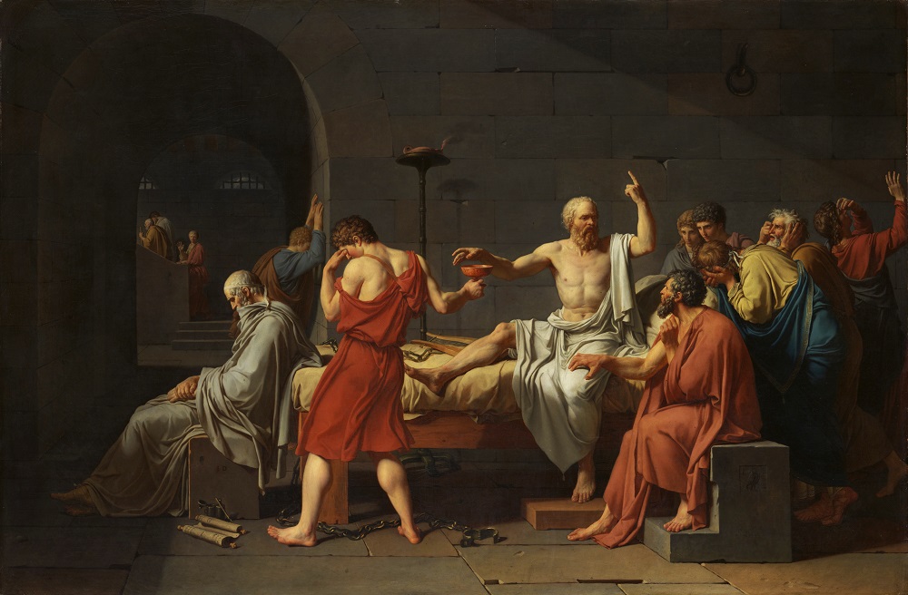
‘Socrates’ is another sculpture that borders on the abstract, yet is still able to evoke the essence of the Greek philosopher. The body is thin, but proudly straight. The mouth is hollow, in the shape of an oval, and wide open. The image of Socrates that I always refer to is from the Jacques Louis David painting, ‘The Death of Socrates.’ While those around him are inconsolable about Socrates being sentenced to death and dying, the philosopher himself is lost in thought, continuing to make his point, a man without fear. Brancusi’s ‘Socrates’ is equally proud and equally committed to the truth. The top of the sculpture looks like a large brain that is very active.
Each sculpture invites this level of contemplation. The distinction between abstraction and realism begins to blur, as does the distinction between motion and stillness. I highly recommend this exhibit, one that has lingered in my mind well after my museum visit was over.
Find out more:
Constantin Brancusi Sculpture
Through February 18, 2019
The Museum of Modern Art
[easyazon_image align=”none” height=”160″ identifier=”0870707876″ locale=”US” src=”https://www.dailyartmagazine.com/wp-content/uploads/2018/08/41wiMh4YZQL.SL160.jpg” tag=”dailyartdaily-20″ width=”121″] [easyazon_image align=”none” height=”160″ identifier=”0262023954″ locale=”US” src=”https://www.dailyartmagazine.com/wp-content/uploads/2018/08/61XK0ZM4T8L.SL160.jpg” tag=”dailyartdaily-20″ width=”115″] [easyazon_image align=”none” height=”160″ identifier=”186171338X” locale=”US” src=”https://www.dailyartmagazine.com/wp-content/uploads/2018/08/417IeusOQpL.SL160.jpg” tag=”dailyartdaily-20″ width=”107″]


