Marian Henel—Tapestries and Madness
Marian Henel’s tapestries are huge. The largest one measures over 6 m in length and 3 m in width (19 ft. 8 in. by 9 ft. 10 in.). Created in the...
Zuzanna Stańska 25 November 2024
For every picturesque painting, there is at least one strange and bizarre counterpart. We usually gloss over the oddities, because, well, they’re just weird. It’s almost like being the weird kid in middle school; you get put in your “box” and people peek in but don’t ask too many questions – that is if they dare to get close. Today, we’re going to dive, headfirst, into that box! So, strap in as we take a look at the top 10 strange paintings.

How can we not begin this list with Hieronymus Bosch’s famously bizarre triptych, The Garden of Earthly Delights? The infamous masterpiece was likely commissioned by Engelbert, Count of Nassau, for the Coudenberg Palace. From outer panels to inside panels, it visualizes the Biblical creation and humanity’s fate, inflicted by our own tragic flaws. The story begins on the outer panels where Bosch created a monochromatic image of the Third Day of the Creation of the World. The half-empty sphere illustrates the formation of Eden as the waters of the world seem to drain and separate. God is perched in the top right corner as he observes his handy-work.
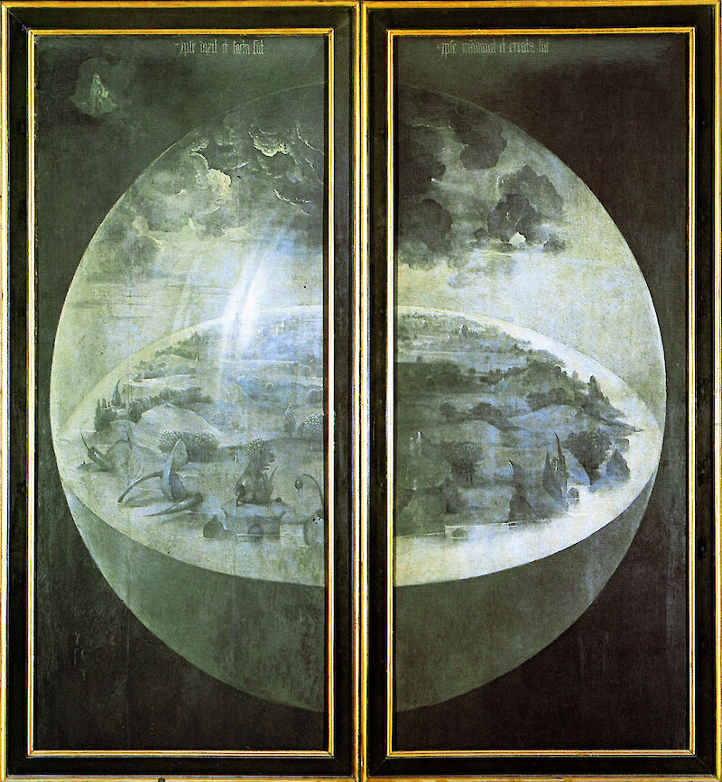
When the outer panels unfold, they reveal three brightly colored panels depicting a common theme: sin. As your eyes move about, you’ll probably conclude Bosch has created an image of a human menagerie. The left and central panels utilize a common horizon line that carries your eyes through Eden. As you take it all in, you’ll also probably wonder what Bosch ate to conjure such surrealistic images. In the air, you’ll find tree-bearing humans sailing through the air atop a swan-lion hybrid. Down on the earthly side, we see humans engaging in all kinds of behavior in a variety of odd places; two figures are laid up inside a clam, two more are face to face standing on their heads, or just chilling in an oddly egg-like object.

Then, on the right panel, all hell breaks loose – quite literally. Most depictions of the fiery depths are quite tame compared to Bosch’s painting. At the top, we see a shadowy city of sorts, illuminated by the fires springing up around it. As your eyes dare venture further down, there’s a pair of ears with a knife protruding through them, humans gathering for shelter, and all manner of strange beasts consuming humans. Just take a look at the blue, bird-like creature towards the right side. Seated atop a toilet-like throne, he is mid-snack while also excreting another human.
Throughout the whole panel, there are several musical instruments that symbolize the evil distractions our senses create. Those ears are the perfect example; the knife piercing them strongly represents that deceptive lure. Many of these symbols are taken straight from the seven deadly sins, themselves, which often leads us to believe that over-indulgence and consumption ultimately lead to our demise. It would take a whole book to unpack all the symbolism jammed into this strange painting. To fall into the rabbit hole of details, click here!

We’ll continue our tour of strange paintings with a portrait of two men? Right? Guess again! The figure in the front is none other than the Bearded Woman of Abruzzi! Nowadays, gender is a fluid concept for most. While we might think this is a relatively new idea, Jusepe de Ribera‘s painting just might prove otherwise. Our lady, Magdalena, wasn’t much of a fan of the Renaissance’s ideal beauty. So, she defied those standards and created her own. Oddly enough, this made her quite famous. In fact, the Viceroy of Naples was fascinated by her and commissioned Ribera to paint her portrait.
While her breast appears a bit out of place, Ribera intentionally depicted her breastfeeding her son to show she is anatomically a woman. Meanwhile, her facial features, beard, and muscular figure juxtapose the womanly task with a masculine image. Even her finely colored robes allude to a manly figure as if, ironically, recalling an image of a Biblical prophet. Magdalena’s husband stands in the shadows behind her, appearing much older and more feeble. Their features and positioning allude to the idea that Magdalena’s reputation overshadows that of her husband, turning the typical marital balance upside down.
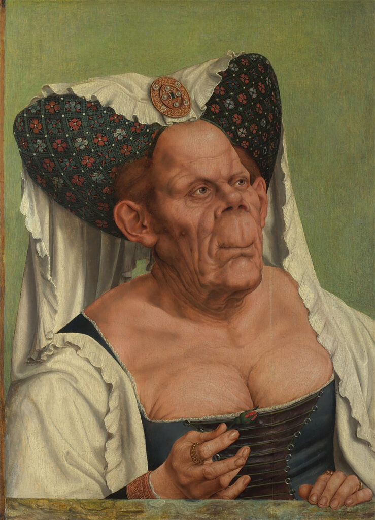
You just can’t help but do a double take with this strange painting. For decades, scholars believed this painting and its partner, Old Man, were satirical statements. The woman before us is dressed as an elderly temptress. In her right hand, she holds a rosebud, which has its own sexual connotations. To enhance that, her low-cut bodice exposes her wrinkled chest, furthering Massys’ allusion to the temptations of the flesh. Another clue is her heart-shaped headdress that seems oddly similar to devilish horns. Speaking of clothing, the artist has chosen to depict her in the rich garments and jewels typical of the upper class. However, those garments had been out of style for about a century by the time she was painted. Overall, it would seem that this pair of highly similar portraits mock the old and ugly for their mischievous, youthful behavior.
Thanks to science, we now know this isn’t the whole truth. A recent analysis of the painting has told us that this woman actually suffered from advanced stages of Paget’s disease, which deforms the bones. Here, that is presented in her oddly arched nostrils, pushed-up nose, elongated upper lip, and enlarged collar bones and forehead. Feel bad now? Yeah, me too.
Before we move on, another fun tidbit worth mentioning is a shared interest in the grotesque and bizarre shared by Quentin Massys and none other than Leonardo da Vinci. Leonardo frequently made studies of grotesque heads, which he likely exchanged with Massys. It was once believed The Ugly Duchess was a lost Leonardo due to its resemblance to two of his drawings. However, it is most likely Massys sent a copy of this portrait to Leonardo which his pupils then copied and altered.
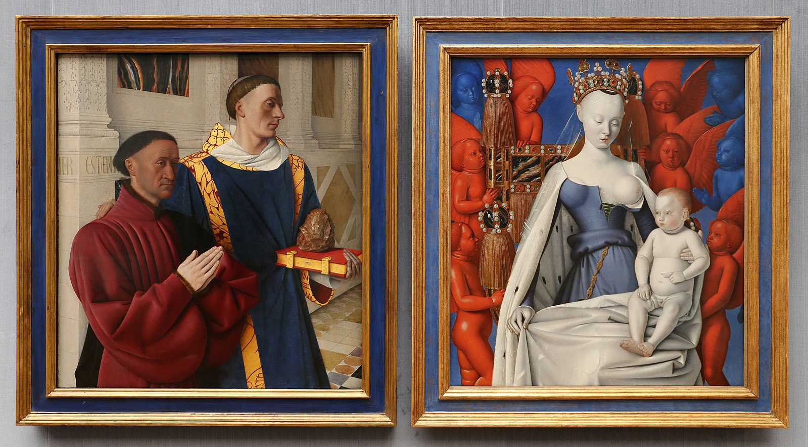
Next up: a late medieval masterpiece and one of the most unorthodox strange paintings of the Virgin Mary in art history. Jean Fouquet was commissioned to paint this diptych by Etienne Chevalier, treasurer to France’s King Charles VII. The left panel depicts the patron with St. Stephen, the first Christian martyr. That part is pretty straightforward. For our purposes today, we’ll focus on the right panel, also known as Madonna Surrounded by Seraphim and Cherubim.
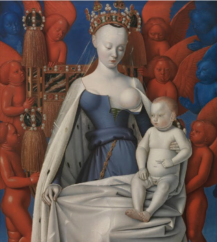
This strange painting is equal parts fantastic and bizarre – and not just because of the freakishly charming seraphim and cherubim surrounding Mary or the man-toddler that is baby Jesus. Jean Fouquet broke with tradition in several ways here. His use of intense color is one but the most striking is his depiction of the Virgin Mary and the woman who served as his model. Now, it’s definitely not an issue that Mary is shown as the Queen of Heaven, as evidenced by her jewel-encrusted crown, throne, and dress. What’s bizarre is that half her chest is exposed, creating quite a sensual, erotic image of a traditionally chaste figure. Imagine the shock this must have given viewers in the 15th century! Said scandal was probably not helped by the fact that Fouquet’s model was likely the king’s mistress, Agnes Sorel.
Sorel’s beauty made quite an impression on the king, which, unsurprisingly, lead her to become his mistress. In this strange painting, Fouquet has captured that beauty, from the way her fashion-forward dress accentuates her body to her porcelain skin, and her demure gaze, she embodies ideal beauty. According to legend, Sorel’s bosom was quite eye-catching. Not to compare apples to oranges, but they are quite askew in both placement and size in the portrait. That factor might make you wonder what the men in the left panel are really looking at.
Sorel was actually more than a mistress who happened to bear the King several children. She was also one of his trusted counselors. During an ill-fated war, Sorel used her charm to gain the financial backing of the wealthy nobles, which in turn aided France in securing its borders. To thank her, Charles made her three children legitimate and promoted her to be his official mistress. In fact, she was the first mistress to be given this title. Said title came with many benefits, including a salary, private chambers, and a substantial place at court. As you could imagine, church officials as well as the King’s own son weren’t thrilled about this. Alas, the pregnant Agnes dropped dead not long after, likely due to mercury poisoning.
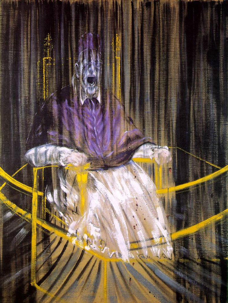
It’s quite unlikely you’ll ever see a figure as dignified as the pope shrieking in public. Luckily, Francis Bacon has brought that delightful image to life for us. During the 1950s Bacon experienced an inspirational shift, trading fantastical creatures for unconventional portraiture. This particular portrait is Bacon’s rendition of Diego Velázquez‘s Portrait of Pope Innocent X from 1650.

Francis Bacon had an opportunity to view his inspiration in person but allegedly never laid eyes on it. He stuck to reproductions of the famous portrait, claiming it would allow him to take greater artistic license with his own work. That license was quite extensive. Bacon often combined images from different places. For this particular strange painting, he took elements of Velázquez’s carefully rendered portrait, such as the gilded throne, his seated position, and vestments and combined them with a scream from Sergei Eisenstein’s 1925 movie, Battleship Potemkin. The manner in which he meshes these elements with a highly dramatic, ghostly color palette gives this painting a totally new, if unsettling, appeal.
This strange painting has been recognized as one of Bacon’s finest from his pope series but the reason why has been unclear for a while. To most, Bacon’s painting is mysterious. As hard as it can be to look at, you almost can’t help but look closer. In contrast to Velázquez’s serene, authoritative pope, Bacon’s seems to have lost all control; just about everything in this painting feels as though it is slipping away. His purple-blue face expresses an expression of silent distress. Bacon’s pope grips the chair as if hanging on, the golden cords extending below the chair seem to be the only boundaries holding him in place. These lines oddly resemble the shape of a boxing ring, perhaps suggesting the eternal, internal struggle we all fight.
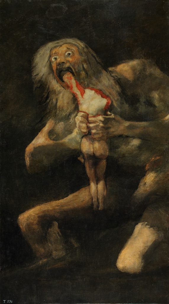
Usually, gods and goddesses are the epitome of beauty and are portrayed as such, even in their most unflattering moments. Enter Francisco Goya! He broke from tradition with this rendition of Saturn. Before we dive into that, let’s take a look at the story behind this strange painting. According to the myth, the titan, Saturn, had been told via prophecy that one of his sons would usurp him and take his power, Naturally, Saturn wasn’t fond of that idea. He liked his power and wanted to keep it. So, Saturn ate one of his sons. Good parenting move, right? What Saturn didn’t know is that his wife, Rei, had hidden her youngest son, Zeus. In the end, Zeus ended up conquering the titans.
At the time Goya painted this, he was contemplating the influences of power on humanity and likely painted this mural, and others, on the walls of his home, the Quinta del Sordo. Ironically, this one was painted on the dining room walls. Here, Goya has created a strikingly dark image that reflects the influence of what is essentially, the ego, on our own behavior, here shown as daddy’s snack time. As if to suggest that power also affects our appearance, he has depicted Saturn as a goblin-like creature, something most would consider sub-human. Saturn does not appear strong or god-like at all; while he appears tall, his limbs seem rather fragile and mangled. His frantic gaze and frazzled appearance reflect his desperation to hold onto his remaining shreds of dignity juxtaposed with the very inhumane action of eating your own offspring. Moral of the story: don’t be power-hungry and don’t eat your kids.
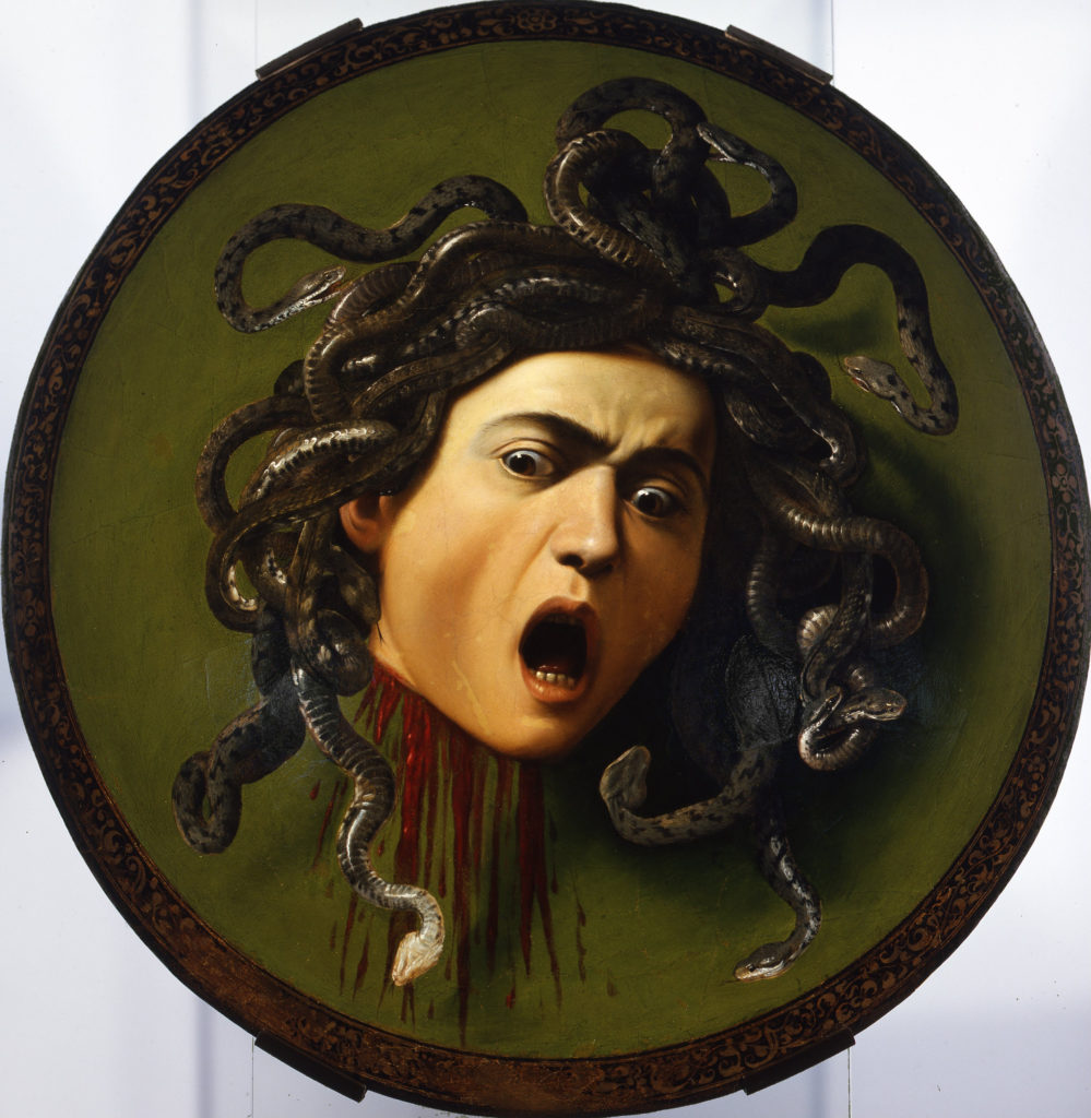
Behold, the severed head of the gorgon, Medusa! You probably know Medusa as the beautiful woman with live snakes for hair or her ability to turn people to stone at first sight. That is, until Perseus beheaded her, using a shield he borrowed from Athena. What’s odd here is not just that Caravaggio used a young male model or that it’s painted on an actual shield, but the moment of the story the artist highlights in this piece.
As the tale would have it, the mirrored shield gifted to Perseus not only allowed him to see Medusa’s reflection but also gave her the chance to glimpse herself one last time. I’d bet those last moments of self-reflection came with some not-so-delightful realizations, seeing as her head is no longer attached to her body. With the backstory accounted for, Caravaggio’s work creates an interesting, albeit disturbing, mirror of Medusa’s last moments.
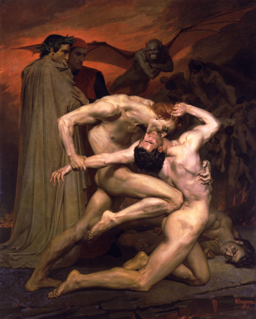
Next up, a dark, yet weirdly interesting painting from the darker side of the Romantic period. French artist, William Adolphe Bouguereau took inspiration from a page of Dante’s Inferno, with a lovely setting- the eighth circle of hell conveniently set aside for falsifiers and counterfeiters. Sounds pleasant enough. That is until you see the smirking bat-demon creature flying above or the strange pile of bodies in the background or the two humans tearing each other to shreds. Those two fighters just happen to be Cappochio, an alchemist and heretic, and Gianni Schinni, who supposedly took another man’s identity in hopes of acquiring his fortune.
These two men were based on real people who were sentenced to death for the crimes mentioned above. Dante knew their stories and decided to include them, and many others, in his epic poem. Behind Cappochio and Schinni stand Dante and Virgil. Dante, in the red cap, looks on as he turns his friend, Virgil, away. If you look closely, you’ll notice Virgil is actually looking off to the right as if he’s seen something even more disturbing than the vampire-esque attack before him. Ironically, Bougueareau’s painting was dubbed a wonderful work of classical painting techniques.
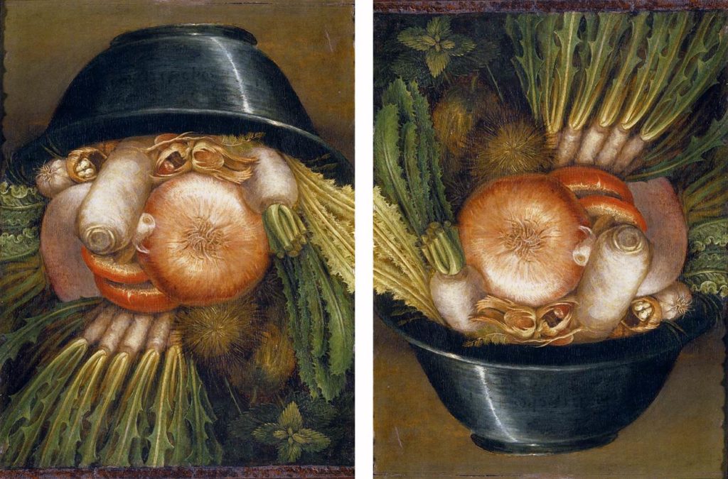
Giuseppe Arcimboldo isn’t a name most are familiar with. Yet, for a painter working during the Renaissance, his paintings are quite bizarre. Despite his unusual style, Arcimboldo’s work became synonymous with Mannerism and the Renaissance obsession with riddles, puzzles, and the strange and bizarre. Maybe that’s why Emperors Maximilian II and Rudolf II added quite a few of his strange paintings to the Kunstkammer (cabinet of curiosities).
Arcimboldo’s painting, The Vegetable Gardener, definitely fits the bill as a curiosity. Like the one above, Arcimboldo’s paintings are composite portraits, meaning he carefully arranged different, yet categorically related objects into the shape of a human bust. The end result is a fascinating, perfectly balanced allegory for different things, such as the seasons, the elements, even occupations. In The Vegetable Gardener, Arcimboldo creates a bust out of different vegetables, topped with a black bowl, clearly meant to represent gardener’s duties. The really cool thing about this one is, it belongs to a group called, “reversible heads.” If we turn the image upside down, it creates a more traditional still life of a bowl of vegetables. I don’t know about you, but once you’ve seen it upside down, it’s hard to un-see it!
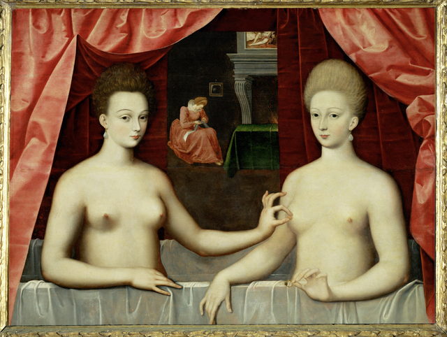
Usually, taking baths with siblings is something we deem appropriate as young children but past a certain age, it’s just strange. At first glance, this bizarre painting seems to contradict that theory. The sister, the Duchess de Villars’ outstretched arm and nipple-pinching suggest some rather naughty things. Even the curtains overhead are parted in a way that alludes to a stage, making the audience feel like peeping toms.
While this painting has been interpreted as a fetishistic piece of homo-erotic art by many for quite some time, history would tell us we should pull our minds out of the gutter. Gabrielle, the pinchee, was mistress to King Henry IV. Oddly enough, many art historians have interpreted the Duchesses’ gesture as an announcement that Gabrielle is pregnant with the King’s illegitimate son. In this case, the nipple pinching is not as naughty as it would seem. Oddly enough, in this setting, it represents fertility, which is reinforced by the figure sewing baby clothes in the background.
If this last painting doesn’t sum up the odd subtleties that make art so weird, I’m not sure what does. We know that some art is just plain strange and bizarre and we have to accept it at face value. However, knowing the visual languages of old can add some extra weirdness to many a piece of art.
DailyArt Magazine needs your support. Every contribution, however big or small, is very valuable for our future. Thanks to it, we will be able to sustain and grow the Magazine. Thank you for your help!