Marian Henel—Tapestries and Madness
Marian Henel’s tapestries are huge. The largest one measures over 6 m in length and 3 m in width (19 ft. 8 in. by 9 ft. 10 in.). Created in the...
Zuzanna Stańska 25 November 2024
MOBA, or the Museum of Bad Art, is replete with almost anything that could be wished for in terms of the good, the bad, the very bad, the hilarious, and of course the ugly. The category of “good” doesn’t really exist here – that much will soon become clear – but it does exist perhaps within other categories. It is surprisingly difficult to find art with absolutely no redeeming features. Some of the pieces are baffling; others could be considered quite good for a third grader perhaps, but should a seventh-grader produce such a travesty a letter would be going home to the parents; some are genuinely hilarious, prompting the viewer to hope that the artist, too, has a sense of humor.
Occasionally some of this awful art offers up something thought-provoking: even bad art can reward our viewing with a memorable experience, even if it’s simply to make us question how it could be possible to enjoy it, and whether or not we should we admit that we did? So without further ado let’s have a look at some of the worst art available to mortal eyes (that we might secretly quite like).
To be merely bad, in this context, is a compliment.
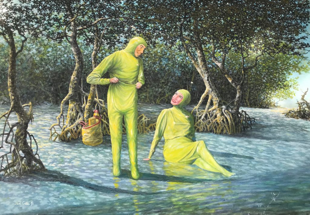
The artist behind this masterpiece, Ted Cate Jr., is in defiance of all reasonable picnic expectations, and clearly has an adventurous “can do” kind of nature. However, Ted, figure drawing is not your strongest artistic talent, at least it is not shining through in this particular piece. The faces are especially interesting, being somewhat flat and barren landscapes against such an interesting backdrop. You are ahead of your time though (or you already regularly wear Hazmat suits to picnic in the swamp). The only things missing from this painting to bring it up to date are face masks.
What intrigues the most here though are the following observations. Firstly, what is the plan for the large, prehistoric and rather toothy swamp-dwelling gators that may be attracted by your activities? Secondly, how do you explain the rather deftly painted environment? The trees, especially the twisted roots and dappled light coming through the leaves are all rather lovely. Ted, please don’t get eaten by an alligator, and please paint more landscapes.
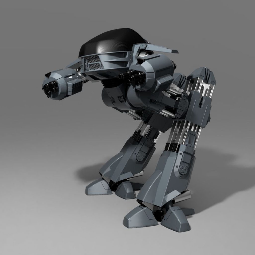
Winning the second-place prize is the Ed-209 from 1987’s RoboCop, otherwise known as Still Life with Juicer.
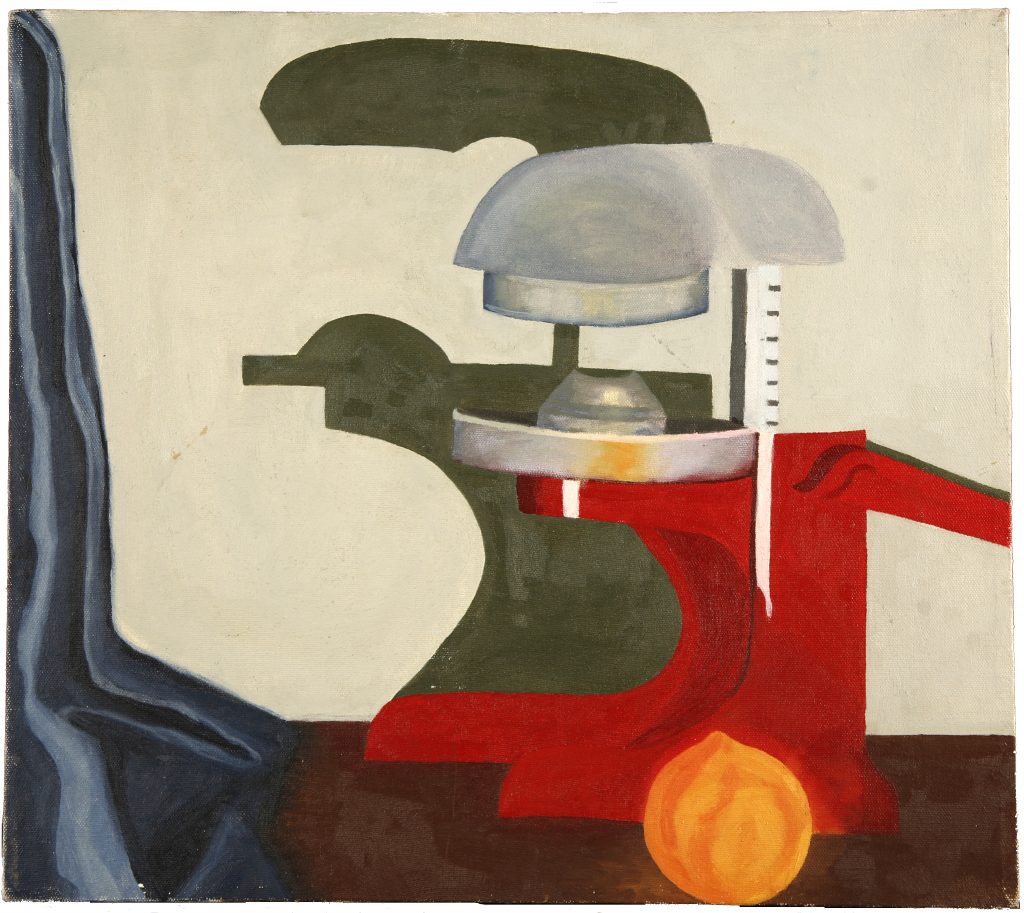
The above kitchen appliance, almost indistinguishable from Ed-209, is the juicer that tells you in no uncertain terms that you have sixty seconds to comply, which can be pretty confusing first thing in the morning. It then proceeds to shoot oranges at your head and squirt juice in your eyes as you frantically try to turn off the rampaging technology behind it. Good luck.
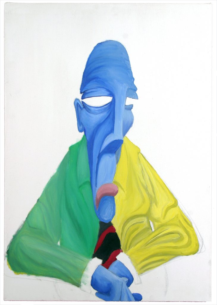
Nice Bluish Man encapsulates everything that we know about feeling sad. He is literally blue and his mouth is in a languid, downturned sulk the weight of which has pulled his entire face down with it. He has a rather unappealing two-toned shirt on, which could be the reason for his bad mood. More likely, it is his absolute absence of eyes that is getting him down, and the probable scenario that every single day of his life, at work, at home, at the gym, people keep on making the same boring joke: “Hey! Kevin! I can see right through you!” Poor guy. He’s too nice to do anything about it.
This next category, the Very Bad, is a matter of interpretation. Sometimes very bad might also be very funny, in which case something good can be extracted from even the worst paintings. This applies to the following two paintings, but the third should be approached with caution.
In Third Place we have Blue Tango, Anonymous (probably for the best). Feast your eyes on the following painting.
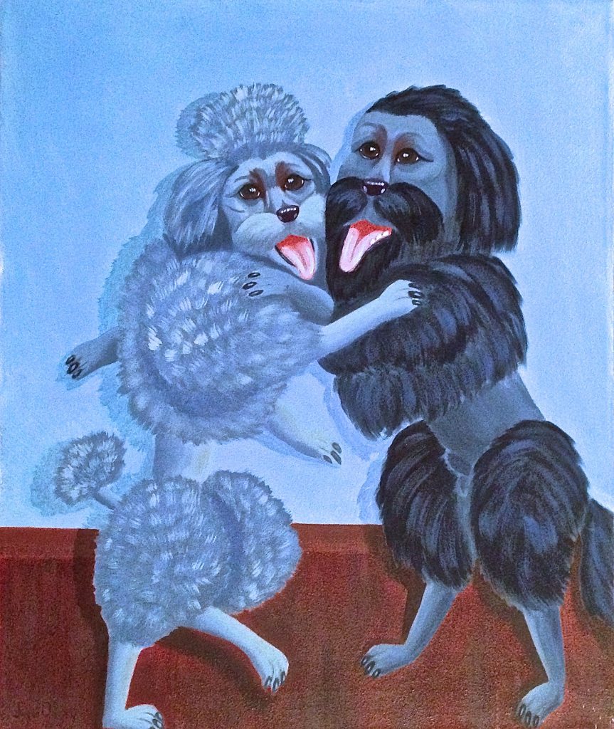
Two dogs, one a poodle and the other with a bad haircut, dance together, panting. The lower limbs seem to make sense, but it is difficult to know what could be happening with the upper ones: that is a very, very long right arm Mr Tango Pooch! There is also a hint of masculinity on the belly of the (clearly male) dog on the right. “He needs less fur!” cries the artist at work. “No! For the love of God he needs more!” cries the viewer. Forward-facing eyes are always alarming when found on a dog or other domestic quadruped. Is this an attempt at humanizing the dancing pair? Only the artist can know that, and only the artist should ever know that.
Home: the place of safety, of familiarity; the place where we grew up; hopefully a happy place where the heart is, so to speak. The home below? Have a look at No Place Like Home.
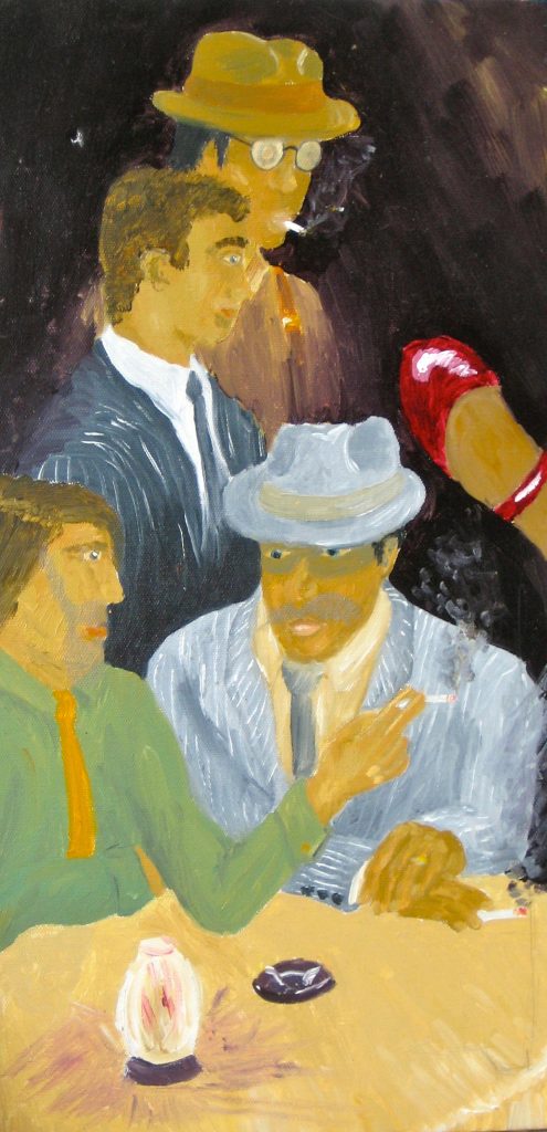
Dodgy anatomy, terrible facial rendering, and horrible perspective are the least of our problems. It’s the disembodied foot flying in from the right that amazes the most, but at least it provides a cue for the imagination to start coming up with possible narratives. Perhaps this person grew up in a bordello. Perhaps this was a nightclub frequently attended by his/her parents. Maybe that foot belongs to a glamorous Flamenco dancer. The title might be a clever one: No Place Like Home, meaning in fact that this is not at all a place like home. Mysteriousness: 4 points. Technical Execution: nil points.
The clear winner of the Very Bad category, this painting is literally haunting. Take a look at it but be warned, it may suck out your soul.
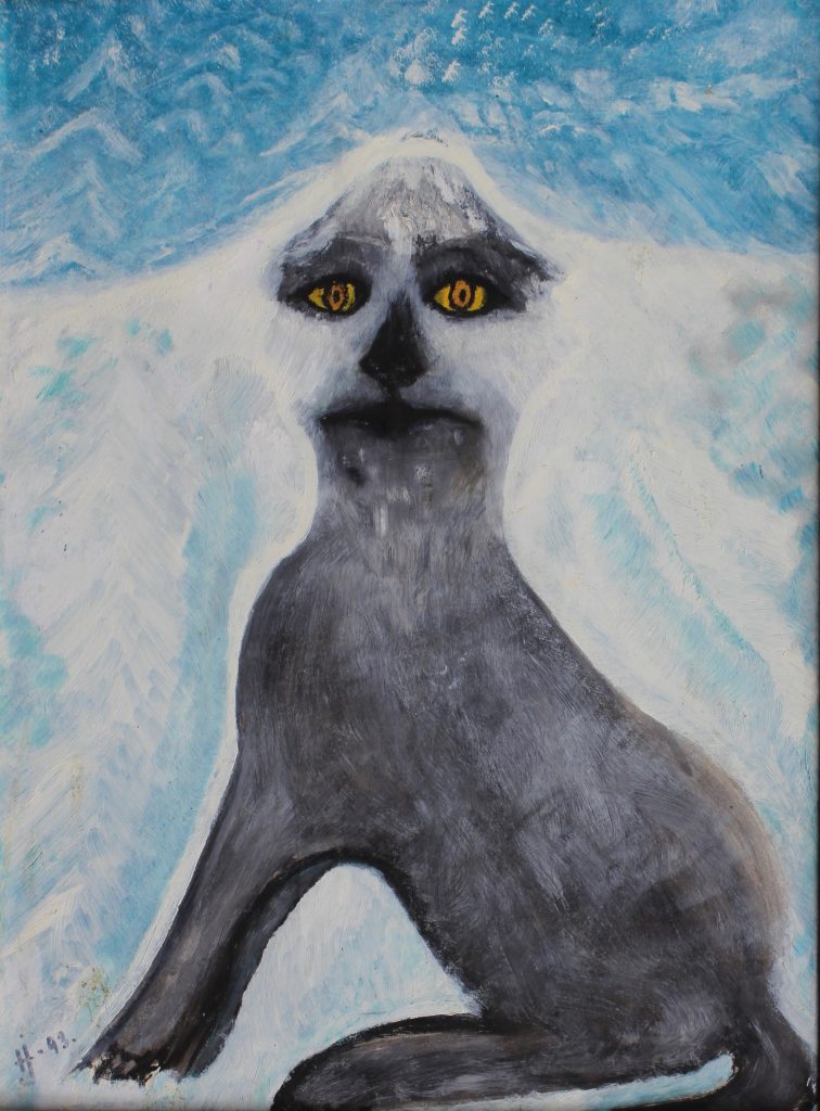
Here is some awful prose to accompany this chilling rendition of a dog living in an Albert Camus novel and unable to escape:
“It was the dog’s gaze that caught my attention first, far off in the distance. It looked small, so sad, and its lostness was a stark silhouette against the frozen landscape. As it grew closer, stumbling in the snow, shivering and alone, the yellow eyes seemed to glow brighter, as though as it drew near it was somehow revived. By the time I realised, it was too late. The dog was upon me. The warmth from my body drained away and all existential meaning deserted me, evaporating as mist into the chill air. The eyes grew brighter still, just for a moment, as the dog’s emptiness consumed me, and then it, too, gently blew away on the breeze.”
– S.M Mills, 2021. (The author apologizes.)
Do not hang this on a wall. It’s dangerous.
Now to the fun stuff. The Ugly category has a distinct crossover with the Hilarious category (although hilarity is a running theme). All artworks featured here have both qualities, to varying degrees, to qualify.
Un Poisson Mort, Anonymous. There are almost no words.
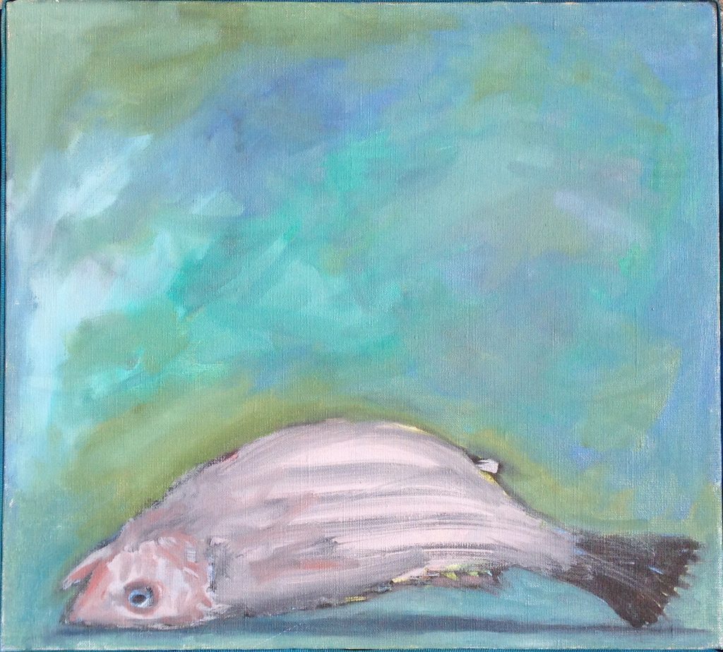
Almost. Of course, there are some words. From the pose of this unfortunate fish we might deduce two possibilities: the first is that it is not dead, but dying. The artist may have captured a fleeting moment as the fish flaps about, gasping, in which case this painting (and the fish) may very well have been executed by quite an accomplished Impressionist. The second is that this fish has been dead for a period long enough for rigor to set in, hence the ability to lie stiffly belly up. If we knew this period we could have a stab at identifying the fish, for example, Haddock are easily stressed, apparently, and so rigor tends to set in earlier (thanks Google).
Is it more worrying that we don’t really know if the fish was already dead when it was painted, or that the artist wanted to paint it in the first place? Something tells me that the artist may have a rather Gothic outlook on life, and fish.
The Second Place prize must be awarded to the following painting.

For this painting we have a description by the artist himself, but we’ll come back to that. Let’s discuss it first. A yellow, blurry face is suspended in the void. The features, while present, are crudely fashioned and appear to melt downwards. Red is a predominant feature and, set against the bright yellow flat plane of the face, we are reminded of an angry, and possibly imminent, furuncle. Despite the obvious irritation of the spatial dullness, the limited but garish color palette, the resemblance to a ripe boil, and the odd disembodiment of the head, the subject looks altogether nonplussed, as if resigned to this state of being. The artist described this work as follows:
This is my partner Lyn, losing the battle with the middle objective of her research grant proposal (something to do with cross-talk between insulin-like growth factor binding proteins and retinoid-X receptor heterodimerization, since you ask).
Lloyd Graham, Museum of Bad Art.
In many ways, therefore, this is a good painting because it has achieved its goal: to demonstrate someone’s frustration at trying to navigate a complicated academic thesis, and feeling as though they will never get it done. On the other hand it looks like the artist went mad with a newly learned potato printing technique, and is so phenomenally ugly, that it deserves no praise at all. Let us not address the title – Aim 2 – for this suggests a series, of which we want no part.
Freedom Beach. Gaze upon its beauteous countenance, and then go and scrub your eyes.
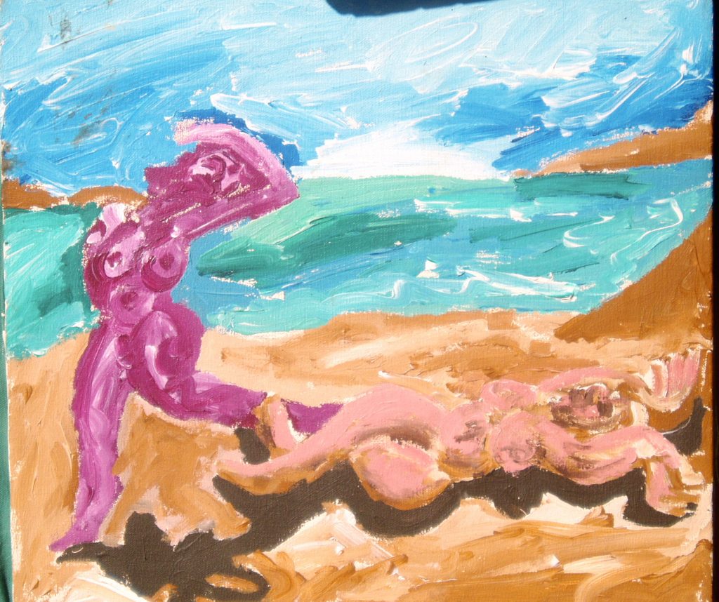
Yet it does have a certain charm. Two women frolic in the sun, abandoning their shyness as they soak up the rays. Freedom indeed! The colors are adventurous, the sand soft, and the scene happy. The figures are curved, with the kinds of proportions that are reminiscent of a Blensdorf sculpture. In its own particular idiom, it’s rather charming.
Please visit MOBA, it is a rewarding experience and while all of the art there is bad in some way, a lot of it has potential, or contains some element that serves to redeem it from being just garbage.
In all of the pieces featured here today there is something that is likable. Sometimes it’s that we see what the artist was trying to achieve and we appreciate it. Sometimes it’s that something resonates with us (that may or may not have been intended at the time of making) and reaches someone somewhere, bringing a moment of joy into their lives. Art that can do that is good art. Sure the colors may be off, the elements badly thought out, or the animals rife with existential crises, but all of this is interesting, amusing, and well worth our time. Give it a try, and very importantly, give the artworks time to be absorbed (except for Dog – don’t absorb that one).
DailyArt Magazine needs your support. Every contribution, however big or small, is very valuable for our future. Thanks to it, we will be able to sustain and grow the Magazine. Thank you for your help!